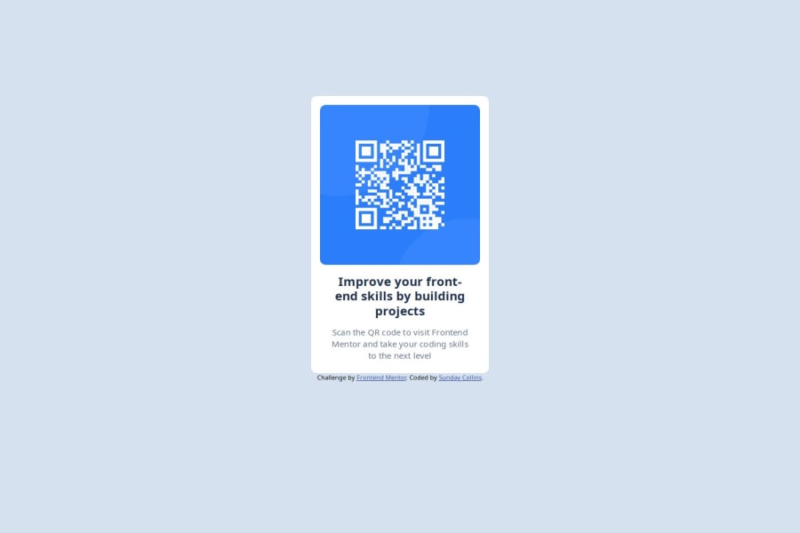


Design comparison

Solution retrospective
I'm proud of being able to get the design details using the figma application.
Next time i'll try to make the project more responsive. I didn't focus on the area of responsiveness in the project.
What challenges did you encounter, and how did you overcome them?Making a proper responsive design is a challenge to me.
I tried making the elements to fit the page using font-sizes, padding and margin.
What specific areas of your project would you like help with?I need help in making the project responsive for both mobile, tablet, and desktop devices.
Community feedback
- P@huyphan2210Posted 6 months ago
Hi, @collins-ai
- Good job on your first challenge! I have a few thoughts for improvement:
- I noticed you're using a lot of
divelements. Whiledivis flexible, it's better to use semantic HTML whenever possible. Semantic tags likeheader,main,section, andfooterimprove accessibility, SEO, and make your code easier to understand for both developers and browsers. Aim to use the most meaningful HTML tags that describe the content. - The goal should be to write the least amount of code while achieving high accuracy. By reducing unnecessary HTML, you can keep your code cleaner and easier to maintain. As you continue practicing, you'll develop a better sense of how to simplify your structure.
- Regarding your question about responsiveness, there's no one-size-fits-all rule for how a page should respond to different screen sizes (mobile, tablet, desktop). Developers usually base responsiveness on the designs provided, but since you're not a PRO user on Frontend Mentor, you don't have access to those files. You can use tools like browser extensions to measure distances and spacing in the JPEG designs available to you.
- If you're unsure about responsive design, I recommend looking at how professionals handle it. There are plenty of resources out there—find one that resonates with you and follow it until you feel confident. Research topics like responsive design, media queries, mobile-first approaches, and semantic HTML to deepen your knowledge.
- Lastly, the most important thing is practice. With continued practice, you'll come up with new ideas and develop a stronger understanding of web development.
Hope this helps!
Marked as helpful0 - @SahmieePosted 6 months ago
the solution does not differ much from the design
Marked as helpful0 - @Rodrigo-PolicarpoPosted 6 months ago
Congratulations for your code!
About the responsive project, can be a little more easier than you imagine. Try to learn a little bit about 'CSS Flex', mainly 'display: flex' and 'flex-wrap', i have sure that will be very useful on this project.
Keep your way up, I hope this comment being useful.
Marked as helpful0


Please log in to post a comment
Log in with GitHub
Join our Discord community
Join thousands of Frontend Mentor community members taking the challenges, sharing resources, helping each other, and chatting about all things front-end!
Join our Discord