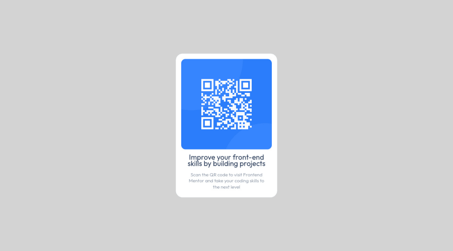
Design comparison
Solution retrospective
Would you mind please revise my QR code component solution and can you please give me feedback on how to measure the padding, margin, and border in an easy way in a short time? and Is there a way to make debugging to my codes?
Community feedback
- @MelvinAguilarPosted almost 2 years ago
Hello there 👋. Good job on completing the challenge !
I have some suggestions about your code that might interest you.
HTML 📄:
- The <br> tag is often used to create line breaks, but it doesn't convey any semantic meaning. When a screen-reader reads the text, it will break the flow of reading at the line break tag, which can be confusing for users. More information here.
CSS 🎨:
- Only use relative units like em or rem for font-size instead of pixels to ensure accessibility for users with larger font settings. You can read more about this here 📘.
- Use
min-height: 100vhinstead ofheight: 100vh. Theheightproperty will not work if the content of the page grows beyond the height of the viewport.
I hope you find it useful! 😄 Above all, the solution you submitted is great!
Happy coding!
1 - @HassiaiPosted almost 2 years ago
There is no need for the <br> in the html.
The body has a wrong a background-color. Use the colors that were given in the styleguide.md found in the zip folder you downloaded.
There is no need for the height value in the body, To center the main on the page using grid, give the min-height a value of 100vh.
Give h1 and p the same font-size of 15px which is 0.9375rem, text-align: center, the same margin-left, margin-right and margin-top values. Give p a margin bottom value.
Hope am helpful.
Well done for completing this challenge. HAPPY CODING
0
Please log in to post a comment
Log in with GitHubJoin our Discord community
Join thousands of Frontend Mentor community members taking the challenges, sharing resources, helping each other, and chatting about all things front-end!
Join our Discord
