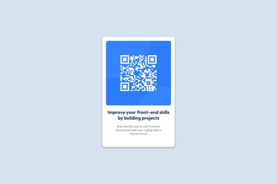
Design comparison
SolutionDesign
Solution retrospective
What are you most proud of, and what would you do differently next time?
I'm most proud of achieving a pixel-perfect match to the design and using semantic HTML effectively. Next time, I would spend more time on optimizing the responsiveness.
What challenges did you encounter, and how did you overcome them?One challenge I encountered was ensuring cross-browser compatibility, which I overcame by thorough testing and using CSS resets.
What specific areas of your project would you like help with?I would appreciate feedback on improving the responsiveness of my layout, particularly in handling various screen sizes and orientations.
Community feedback
Please log in to post a comment
Log in with GitHubJoin our Discord community
Join thousands of Frontend Mentor community members taking the challenges, sharing resources, helping each other, and chatting about all things front-end!
Join our Discord
