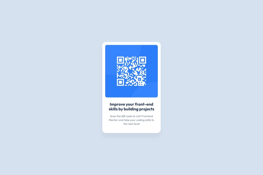
Design comparison
Community feedback
- @SafeNSound95Posted about 1 year ago
Very good eye for details.
a couple of notes though:
I think centering the card component like the original design intended would look better, as well as pushing the attribution to the bottom.
a slight increase of padding-left and padding-right would allow the card to breathe more as well.
Marked as helpful1@meriemgflPosted about 1 year agoThank you @SafeNSound95 for taking the time to check my submission.
I appreciate your feedback and I will update my work with the improvements you have suggested.
Edit: I have implemented your suggestions in my code. Thank you again for your valuable feedback.
1@SafeNSound95Posted about 1 year ago@meriemgfl Excellent, very close to the original design.
Keep it up.
Marked as helpful1
Please log in to post a comment
Log in with GitHubJoin our Discord community
Join thousands of Frontend Mentor community members taking the challenges, sharing resources, helping each other, and chatting about all things front-end!
Join our Discord
