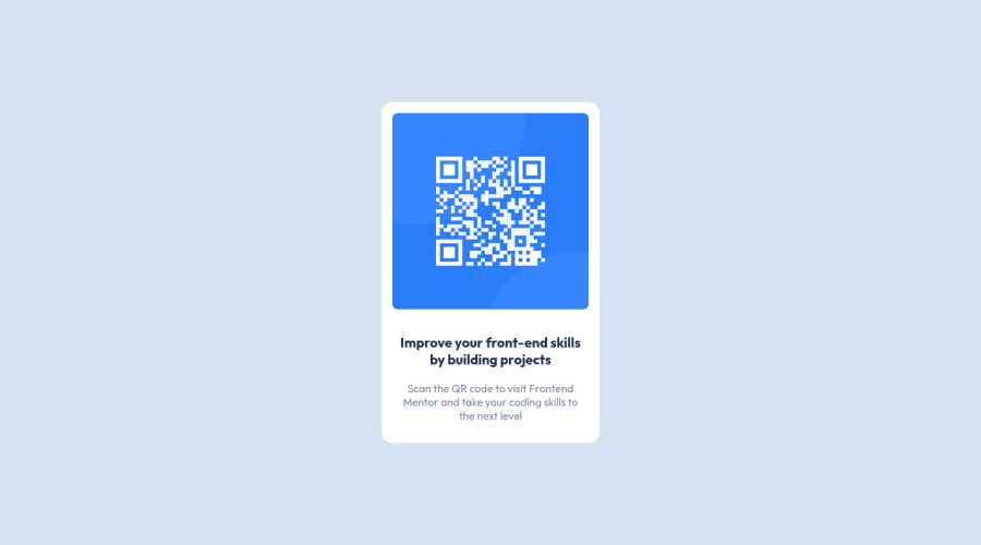
QR code component using HTML, CSS, and Sass
Design comparison
Community feedback
- @amulyalovescodingPosted over 2 years ago
Hello Adam Wilder, Congratulations on completing this challenge! I really liked the result of your project, but I have some tips that I like to share:
1- Every page should have one main landmark <main>. So replace the div that wraps the whole content with <main> to improve the accessibility. click here
2- All page content should be contained by landmarks, you can understand better by clicking here: click here
✌️ I hope this helps you. Happy Coding.
Marked as helpful1@wilderav86Posted over 2 years ago@amulyalovescoding Thanks for the tip! I'll add those.
1
Please log in to post a comment
Log in with GitHubJoin our Discord community
Join thousands of Frontend Mentor community members taking the challenges, sharing resources, helping each other, and chatting about all things front-end!
Join our Discord
