

Design comparison
SolutionDesign

Community feedback
- @DarkstarXDDPosted about 2 months ago
Nice solution. I have couple of suggestions.
- You should never give a fixed
heightfor text containers. In yourcard__contentclass you are using a fixed height. If some more text were added to the children of that element, text will overflow. Because of the fixed height the container can't grow freely to fit all the text content. There's no need to specifyheightfor text containers. The browser will calculate it for you based on the content inside the element, and stuff like font size, padding etc. - Same with the
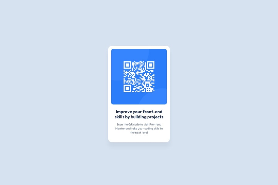
height: 100vhonmain. Usemin-height: 100vhthere, so yourmaincan grow if needed. - I wouldn't use a background image here. I would use an
imgtag, so that i can give it analttext like "QR code leads to frontendmentor.io". Currently if a screen reader user comes across this component there is no way for them to know that there is a QR image present in this.
But yeah, other than that, it's a nice solution.
Marked as helpful0P@Matthieu83600Posted about 2 months ago@DarkstarXDD
You are absolutely right with your suggestions; I've made the necessary changes. 😊
0 - You should never give a fixed
- @rizkirisjadPosted 2 months ago
nice
0 - @m4rconePosted 2 months ago
Ponto positivo que encontrei que difere da minha solução é o uso de variáveis no css. Única dúvida que fiquei é por que não utilizou a tag <img> e sim uma div que carrega o background da imagem do QR code.
0P@Matthieu83600Posted 2 months ago@m4rcone
Si je devais modifier mon code, je pourrais ajouter du texte par-dessus l'image, par exemple, sans avoir besoin d'utiliser d'index.
0


Please log in to post a comment
Log in with GitHubJoin our Discord community
Join thousands of Frontend Mentor community members taking the challenges, sharing resources, helping each other, and chatting about all things front-end!
Join our Discord