Submitted 2 months ago
QR-code-component using Html and Tailwind CSS
#tailwind-css

@Paulgulti

Design comparison
SolutionDesign

Solution retrospective
What challenges did you encounter, and how did you overcome them?
The parent div with the 100vh vh needs the property display flex inorder for the child div elements to arrange vertically.
Community feedback
- P@niuguyPosted 2 months ago
(Below is generated by cursor and edited by myself)
- Semantic HTML Looking at the HTML structure:
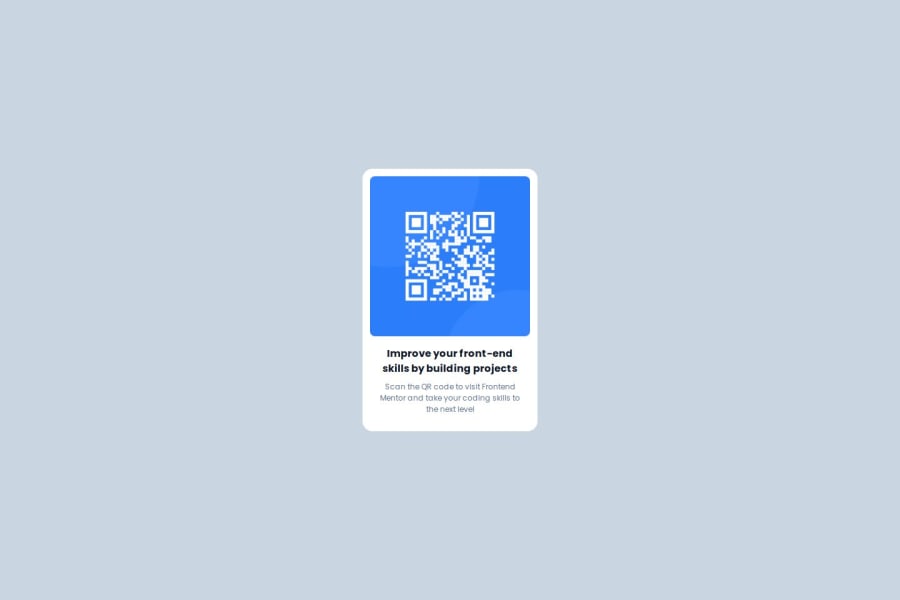
    <div class="body h-[100vh] flex bg-slate-300">
        <div class="card w-[280px] h-[420px] m-auto bg-white rounded-2xl p-3">
            <div class="">
                <img class="rounded-lg" src="images/image-qr-code.png" alt="qr-code-image">
            </div>
            <div class="p-4 mx-auto">
                <h1 class="font-bold text-slate-900 text-center">Improve your front-end skills by building projects</h1>
                <p class="font-normal text-slate-500 text-[12px] text-center my-2">Scan the QR code to visit Frontend Mentor and take your coding skills to the next level</p>
            </div>
        </div>
    </div>
he solution uses basic div elements without semantic HTML tags. It could be improved by using:
- main for the main content wrapper
- article or section for the card component
- header for the title section
- footer for the descriptive text
- Accessibility
Several accessibility improvements could be made:
- Missing alt text is descriptive but could be more specific for the QR code
- No ARIA landmarks or roles are defined
- Color contrast appears good (dark text on white background)
- Missing language attributes for text content
- No skip links (though not critical for this simple layout) Suggested improvements:
<main class="h-[100vh] flex bg-slate-300"> <article class="card w-[280px] h-[420px] m-auto bg-white rounded-2xl p-3" role="article"> <div class="qr-container"> <img class="rounded-lg" src="images/image-qr-code.png" alt="QR code linking to Frontend Mentor website" /> </div> <header class="p-4 mx-auto"> <h1 class="font-bold text-slate-900 text-center"> Improve your front-end skills by building projects </h1> <p class="font-normal text-slate-500 text-[12px] text-center my-2"> Scan the QR code to visit Frontend Mentor and take your coding skills to the next level </p> </header> </article> </main>- Responsive Design
The layout uses:
- Flexbox for centering
- Fixed width (w-[280px]) and height (h-[420px]) for the card
- Viewport height (h-[100vh]) for full-height layout While this works, it could be improved by:
- Using responsive units (rem/em) instead of fixed pixels
- Adding media queries for different screen sizes
- Considering minimum margins for very small screens
- Code Structure The code is: ✅ Relatively clean and readable ✅ Uses Tailwind CSS classes logically ✅ Maintains consistent indentation Areas for improvement:
- Separate components into reusable parts
- Use more semantic class names
- Consider extracting common styles into Tailwind components
- Design Fidelity
The implementation appears to be aligned with requirement on:
- Centered card layout
- Rounded corners
- Appropriate spacing
- Typography hierarchy
- Color scheme using slate colors
Marked as helpful0

Please log in to post a comment
Log in with GitHub
Join our Discord community
Join thousands of Frontend Mentor community members taking the challenges, sharing resources, helping each other, and chatting about all things front-end!
Join our Discord