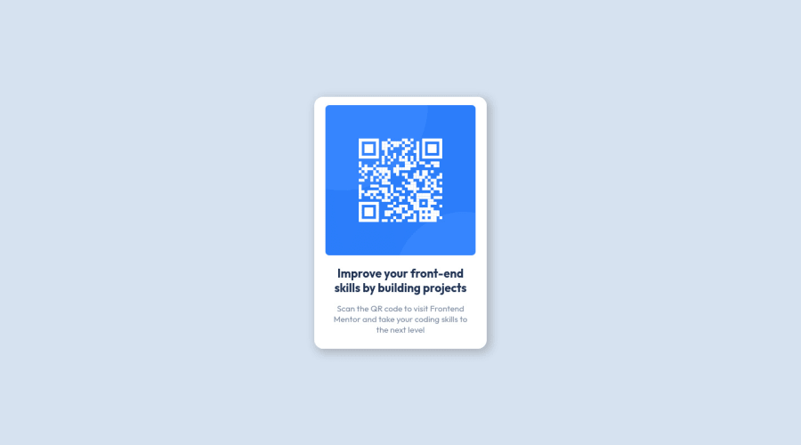
Design comparison
Community feedback
- @muben88Posted about 3 years ago
Hi @sarahrchl, your solution looks perfect!
Just a small note, you can fix accessibility issues by wrapping everything inside a main tag instead of using div, as it will be more semantic. Also, try to use an h1 instead of an h2 tag, it's important to go from h1 ==> h5 as much as you can. And one last notice, it would be better if you used an alt for your image, as it's important for users who depend on screen readers. Good luck!
0@sarahrchlPosted about 3 years ago@muben88 Hi! As a beginner, this is really helpful! Will edit and definitely try those on the next challenges :) thanks!
1@muben88Posted about 3 years ago@sarahrchl Well, I am also just a beginner though. Good Luck ;)
0
Please log in to post a comment
Log in with GitHubJoin our Discord community
Join thousands of Frontend Mentor community members taking the challenges, sharing resources, helping each other, and chatting about all things front-end!
Join our Discord
