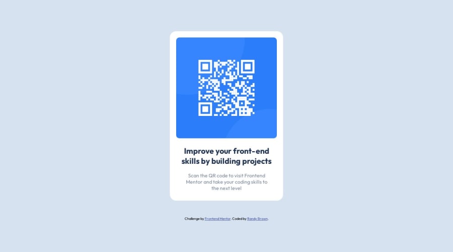
Design comparison
SolutionDesign
Community feedback
- @0xabdulkhaliqPosted over 1 year ago
Hello there 👋. Congratulations on successfully completing the challenge! 🎉
- I have other recommendations regarding your code that I believe will be of great interest to you.
HTML 🏷️:
- This solution may cause accessibility errors due to lack of semantic markup, which causes lacking of landmark for a webpage and allows accessibility issues to screen readers, due to accessibility errors our website may not reach its intended audience, face legal consequences, and have poor search engine rankings, highlighting the importance of ensuring accessibility and avoiding errors.
- What is meant by landmark ?, They used to define major sections of your page instead of relying on generic elements like
<div>or<span>. They are use to provide a more precise detail of the structure of our webpage to the browser or screen readers
- For example:
- The
<main>element should include all content directly related to the page's main idea, so there should only be one per page - The
<footer>typically contains information about the author of the section, copyright data or links to related documents.
- The
- So resolve the issue by replacing the
<div class="container">element with the proper semantic element<main>in yourindex.htmlfile to improve accessibility and organization of your page
.
I hope you find this helpful 😄 Above all, the solution you submitted is great !
Happy coding!
0 - @Shivraj-K09Posted over 1 year ago
Overall, the code structure is good and easy to understand. You have used appropriate HTML tags and included a
metaviewport tag for responsiveness. Your CSS selectors are also properly named.However, there are some areas of improvement that I would like to mention:
- In the
style.cssfile, the font size unit for.howselector is missing (it currently reads asfont-size: px;), which may cause issues in your webpage's display. You should edit this line to include a validfont-sizeunit such aspx,em, or%. - The
max-widthproperty for.containerselector has a fixed value of360px, which might be too small for certain devices. Instead, you can use amax-widthvalue inemor%units to make your webpage more responsive. - The
justify-contentproperty is not applicable to the.attributionselector as it is currently adivelement. You may want to either give it a display offlexor usetext-align: centerinstead. - In the
attributionsection, the challenge link to "Frontend Mentor" should have therel="noopener noreferrer"attribute added to the<a>tag. This attribute is used as a security measure to protect against vulnerability exploits related to link hijacking, by preventing the new page from being opened in the same window, potentially allowing the destination site to take control of the source site.
Other than these minor issues, your code looks good and functions as intended. Good job and Happy Coding 🫡😉
0 - In the
Please log in to post a comment
Log in with GitHubJoin our Discord community
Join thousands of Frontend Mentor community members taking the challenges, sharing resources, helping each other, and chatting about all things front-end!
Join our Discord
