Design comparison
Solution retrospective
I am most proud of learning new techniques to center an element using Flexbox. This method is more modern and versatile compared to traditional position properties. Next time, I would like to explore using CSS Grid for layout management, as it offers more control over complex designs.
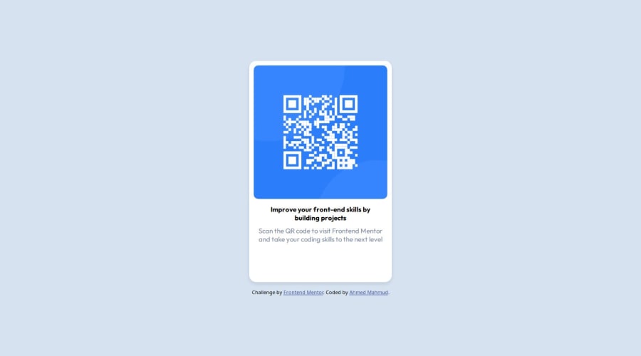
What challenges did you encounter, and how did you overcome them?One of the main challenges I encountered was centering the QR code component card using position properties. Initially, I struggled with making the card perfectly centered both vertically and horizontally. To overcome this, I used Flexbox, which made the centering process straightforward and responsive. The properties justify-content: center and align-items: center were particularly helpful.
What specific areas of your project would you like help with?I would like help with receiving constructive feedback on the overall design and code structure of my project. Specifically, I am looking for feedback on:
- The effectiveness of my use of Flexbox for layout.
- Suggestions for improving the responsiveness and accessibility of the component.
- Any advanced CSS techniques that could enhance the visual appeal and performance of the component.
Community feedback
Please log in to post a comment
Log in with GitHubJoin our Discord community
Join thousands of Frontend Mentor community members taking the challenges, sharing resources, helping each other, and chatting about all things front-end!
Join our Discord
