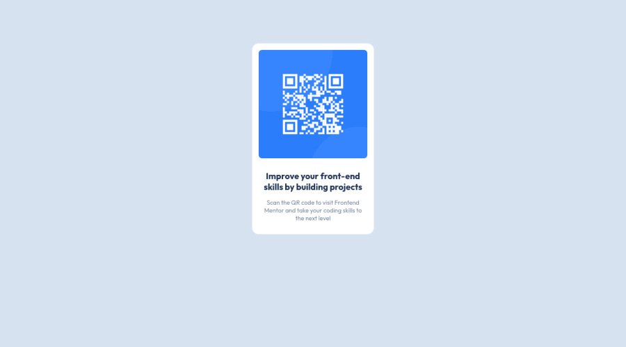
QR code component using HTML and CSS with Flexbox
Design comparison
Solution retrospective
I am sure the code can be improved. What could make it shorter and cleaner?
Community feedback
- @denieldenPosted about 3 years ago
Hi Carlos, great job! Congratulations on completing the challenge.
I had a look at your solution and I have a few suggestions for you:
- add
maintag and wrap the card for Accessibility - try to remove all
marginfromcontainerclass and use flexbox to the body for center the card. Read here -> flex guide - also set
heigthof body to100vhbecause Flexbox aligns to the size of the parent container.
Also avoid assigning specific properties to the
divelement, rather create a class.Overall you did well! Hope this help and happy coding!
Marked as helpful0@Karlof99Posted about 3 years ago@denielden Hi Daniel, Thank you very much for your comments. I find them very helpful. I'll modify my code with these reccomendations and others that have been seen to me. Regards
1 - add
- @sanketcharanpahadiPosted about 3 years ago
- Always wrap your main content inside the
<main></main>tag like this
2.don't use inline styles as you have done in the <img> element 3. use relative widths and max-width property. 4. set the font family inside the body element .
Marked as helpful0@Karlof99Posted about 3 years ago@sanketcharanpahadi Hi Sanket, Thank you very much for your comments. I'll modify my code with these reccomendations and others that have been seen to me. I find them very helpful. Regards
1 - Always wrap your main content inside the
Please log in to post a comment
Log in with GitHubJoin our Discord community
Join thousands of Frontend Mentor community members taking the challenges, sharing resources, helping each other, and chatting about all things front-end!
Join our Discord
