

Design comparison

Solution retrospective
I'm proud that i was able to finish the task giving.and i made research on what i didn't understand.
What challenges did you encounter, and how did you overcome them?I had challenges styling my code using CSS,and i was able to overcome it by making research and watching youtube video.
What specific areas of your project would you like help with?styling CSS
Community feedback
- @Islandstone89Posted about 2 months ago
HTML:
-
It's generally recommended to use classes instead of IDs. This article explains the use cases for the
idattribute. -
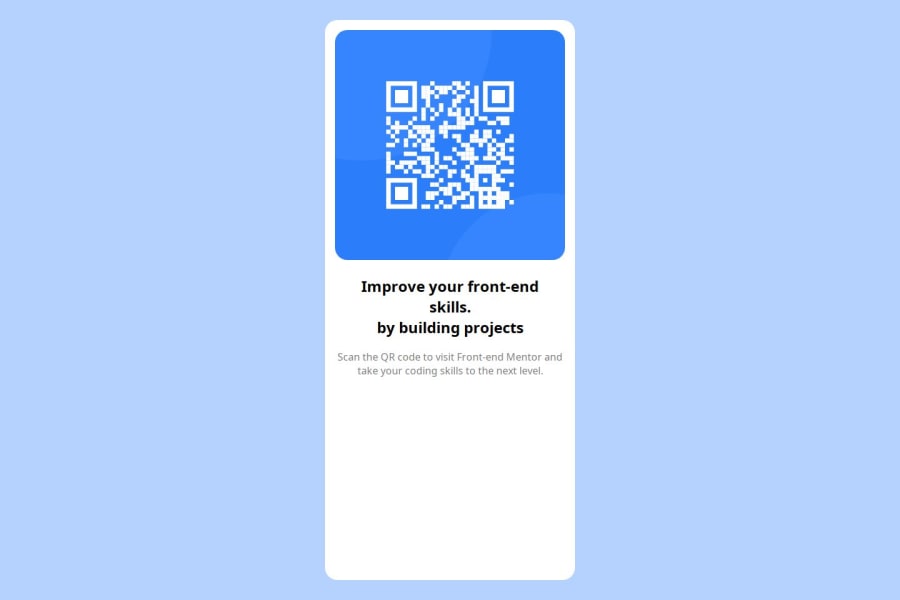
The alt text must also say where it leads(the frontendmentor website). You should not include words like "image", as screen readers will read that by default. A good alt text would be "QR code leading to the Frontend Mentor website."
-
Do not use
<br>to force text onto a new line. The text should flow naturally, and all styling, including space between elements, should be done in the CSS.
CSS:
-
Including a CSS Reset at the top is good practice.
-
Use the style guide to find the correct
font-family, and remember to specify a fallback font:font-family: 'Outfit',sans-serif; -
On the
body, changeheighttomin-height- this way, the content will not get cut off if it grows beneath the viewport. Also addalign-items: center. -
On the card, remove
widthand replace it withmax-width: 20rem- this prevents the card from growing too wide on larger screens. You can also removeheight: auto, as that is the default value. -
Since all of the text should be centered, you only need to set
text-align: centeron the body, and remove it elsewhere. The children will inherit the value. -
On the image, add
display: blockand changewidthtomax-width: 100%- the max-width prevents it from overflowing its container. Without this, an image would overflow if its intrinsic size is wider than the container.max-width: 100%makes the image shrink to fit inside its container. -
As the design doesn't change, there is no need for any media queries. When you do need them, they should be in
remorem, not px. Also, it is common practice to do mobile styles first and use media queries for larger screens.
0 -
- @SvitlanaSuslenkovaPosted about 2 months ago<main> height: auto; Maybe, try to remove this.0


Please log in to post a comment
Log in with GitHubJoin our Discord community
Join thousands of Frontend Mentor community members taking the challenges, sharing resources, helping each other, and chatting about all things front-end!
Join our Discord