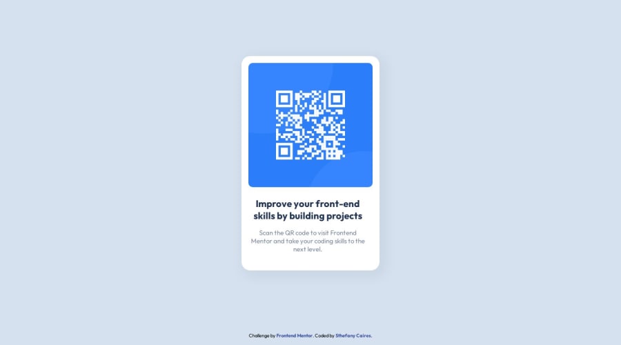
Design comparison
Community feedback
- @Islandstone89Posted 11 months ago
Hi, here is some feedback - hope it helps :)
HTML:
-
You don't need a
<header>in this challenge, only a<main>and a<footer>. Move the image into the<main>. You don't need any divs, you can use the<main>as the card. -
The alt text also needs to say where it leads (frontendmentor.io).
CSS:
-
Performance-wise, it's better to link fonts in the
<head>of the HTML than using@import. -
It's good practice to include a CSS Reset at the top.
-
font-sizemust never be in px. This is bad for accessibility, as it prevents the font size from scaling with the user's default setting in the browser, Use rem instead. -
On the
body, changeheighttomin-height. -
Remove the fixed widths and heights. You rarely want to set fixed dimensions, as this easily creates issues with responsiveness.
-
Add a
max-widthof around 20rem on the card, to prevent it from getting too wide on larger screens. -
Since all of the text is centered, you can set
text-align: centeron thebody, and remove it elsewhere. The children of thebodyinherit the value. -
It's common to add
display: blockandmax-width: 100%to images - the max-width prevents it from overflowing its container.
Marked as helpful1@sthefanycairesPosted 11 months agoHello @Islandstone89! Thank you so much for your feedback! I made some changes to the code following the tips you mentioned, but I removed some elements from CSS Reset that I wasn't using and created an
<article>tag with the<h1>and<p>tags, because the distance between the image and the<h1>was different from the distance between<h1>and<p>. Your tips really helped me improve my code, thank you!1 -
- @Islandstone89Posted 11 months ago
@sthefanycaires happy to help :) well done for taking on the feedback and implementing the changes.
A few things to take note of:
-
You shouldn't wrap the text in an
<article>. Regarding the spacing, you can check the DevTools to see if there's any default padding or margin that needs to be removed. -
The default font size is 16px, so you don't have to explicitly declare it.
-
Remove the margin on the body.
-
Remove the percentage width on the card, and the height, as
autois the default. -
As the design doesn't change, there is no need for any media queries. When you do need them, they should be in rem instead of px. Also, we normally want to do mobile styling first, and use media queries for larger screens, using
min-width.
0 -
Please log in to post a comment
Log in with GitHubJoin our Discord community
Join thousands of Frontend Mentor community members taking the challenges, sharing resources, helping each other, and chatting about all things front-end!
Join our Discord
