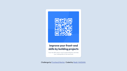
Submitted almost 3 years agoA solution to the QR code component challenge
QR Code Component using HTML & CSS
@nadrsturk

Solution retrospective
I'm so excited to be taking on my first challenge in this amazing community! It was the perfect opportunity for me to put my HTML and CSS skills to the test, and I've already learned so much from trying to center the elements using flexbox. I love how everyone here is so supportive and always willing to lend a hand, so I'd really appreciate any feedback or tips you can share with me 😀 By the way, I've actually started two other challenges, so I'll be posting those in the next few days too.
Code
Loading...
Please log in to post a comment
Log in with GitHubCommunity feedback
No feedback yet. Be the first to give feedback on Nadir HASSANI's solution.
Join our Discord community
Join thousands of Frontend Mentor community members taking the challenges, sharing resources, helping each other, and chatting about all things front-end!
Join our Discord