qr-code-component using HTML and CSS


Design comparison

Solution retrospective
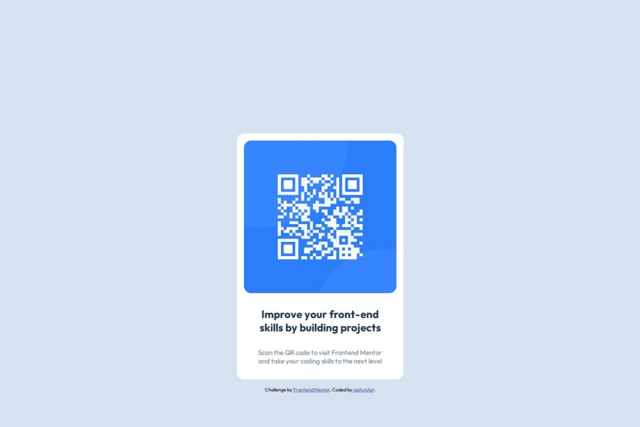
I am most proud of successfully building a fully responsive and visually appealing QR Code component using semantic HTML5 and CSS. This project allowed me to focus on clean, accessible code while maintaining a simple yet effective design. I also enjoyed experimenting with HSL color codes to create a consistent and vibrant color palette, and integrating Google Fonts to enhance the overall typography.
One thing I would do differently next time is to further optimize the layout for larger screens. While the mobile-first design works well for small and medium devices, I feel there is room for improvement in scaling the design for desktop displays. Additionally, I would like to explore using CSS Grid alongside Flexbox to create more complex and flexible layouts.
Lastly, I would aim to implement a more thorough testing process to ensure cross-browser compatibility and accessibility compliance from the start, which would enhance the project’s usability across different environments.
What challenges did you encounter, and how did you overcome them?One of the main challenges I faced was ensuring the layout remained responsive across different screen sizes. Initially, the QR code component looked great on mobile devices but appeared misaligned or too small on larger screens. I overcame this by adopting a mobile-first workflow and using Flexbox for layout adjustments. By setting flexible width and height properties and using media queries, I was able to achieve a balanced, responsive design.
Another challenge was selecting the right color combinations using HSL to ensure good contrast and readability. Some color choices initially made the text hard to read. I resolved this by referring to accessibility guidelines on web.dev, testing various HSL values, and using tools like contrast checkers to ensure the design met accessibility standards.
Lastly, I encountered minor issues when integrating Google Fonts. The fonts weren't loading correctly due to a missing import link in the HTML file. I fixed this by carefully reviewing the integration steps on Google Fonts and properly adding the tag in the section of my HTML document.
What specific areas of your project would you like help with?Layout Optimization for Larger Screens: While the design works well on mobile devices, I would appreciate feedback on how to better optimize the layout for larger screens. Are there specific techniques or best practices I could implement to make the design more visually appealing and balanced on desktops?
Accessibility Improvements: I aimed to make the project accessible by using semantic HTML5 and ensuring good color contrast. However, I’d like guidance on any additional accessibility improvements I could make, especially for users who rely on screen readers or keyboard navigation.
Code Optimization: I tried to keep my CSS clean and organized, but I’m open to suggestions on how to further optimize or refactor my code for better readability, maintainability, or performance.
Cross-Browser Compatibility: I tested the project in a few modern browsers, but I would appreciate any tips or tools for ensuring better cross-browser compatibility, especially for older browsers like Internet Explorer or Edge Legacy.
Design Feedback: Finally, I’d love feedback on the overall visual design and user experience. Are there any small tweaks or enhancements that could make the component more engaging or professional-looking?
Community feedback
Please log in to post a comment
Log in with GitHubJoin our Discord community
Join thousands of Frontend Mentor community members taking the challenges, sharing resources, helping each other, and chatting about all things front-end!
Join our Discord