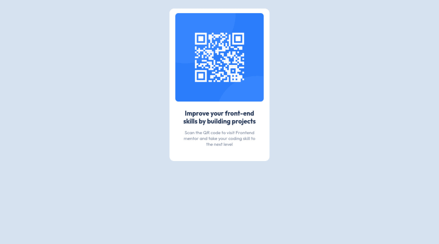
Design comparison
Solution retrospective
It took me the longest time to figure out how to add the white box around the content (the img, and the text).
Is there another way to make the what box around the image other than what I did? I also used <br> to create the text-wrap effect however, agin i'm not sure if thats the way to go about it.
Feed back is very welcome as I am only a week into this and would love to learn the correct process.
Community feedback
- @fadhilradhPosted about 2 years ago
Hi Jessie,
It's amazing that you manage to create this awesome looking card when you just a week into this. Way to go !
I have taken a look at your
index.html
file, and I have a few suggestion and answer for your question.Is there another way to make the what box around the image other than what I did?
Yes, and this should be made using
padding
, since it is the way CSS makers give for exactly this kind of design. It gives an inside space, between border and the content. So, instead of givingmargin: auto
to yourimg
, you should give your.box
class apadding
. You can write :.box { padding: 15px }
I'm not sure about how much px is correct for this design, you can change it as you like.
I also used <br> to create the text-wrap effect however, agin i'm not sure if thats the way to go about it.
Sure, using
<br>
is acceptable method for text-wrap. Me and my coworkers still used it in our day to day job. So no problem with that.I have a few more suggestions, but it's totally optional for you to implement it.
Firstly, the card is in the center of the viewport in the design. The easiest way to position it is using
flex
in your parent element (body
in this case). Like so :body { display: flex; justify-content: center; align-items: center }
This should nicely center your card.
Secondly, I notice that the font used is not the same as the design. I took a look at the challenge's
style-guide
isOutfit
(https://fonts.google.com/specimen/Outfit). You can easily change this by includinglink
tag to this Google Font and paste it anywhere inside your HTML's<head>
tag. Here I copied the link for you :<link href="https://fonts.googleapis.com/css2?family=Outfit:wght@400;600;700&display=swap" rel="stylesheet">
Just paste it inside your
<head>
tag. Finally, you need to use thefont-family
in your CSS. In this case because the design only has one font, you can add it globally in yourbody
selector like so :body { ...your CSS... font-family: 'Outfit' }
And the font should change.
That's all. Just DM me if any of my suggestion is not working properly.
Good luck !
Marked as helpful1@JessfabianPosted about 2 years ago@fadhilradh Thank you! I tend to pick things up fairly quickly. I took note of the padding you both mentioned. I tried it originally but I had tried adding the padding to the img originally then changed it when I created the new box div.
I updated the code with the font link and the coding for centering the display. I for the life of me could't figure out how to get it centered like everyone else!
1@fadhilradhPosted about 2 years ago@Jessfabian You have talent then, just keep coding!
I looked your updated version and it's much better. It is now centered and the font matches the design. Congrats!
0 - @TwistusPosted about 2 years ago
To add a white or any kind of internal space to any element you can use "padding" property. Padding also can help to create natural text-wrap. For example if you'll wrap this piece of code in some container (in this example <div class="text">) : "
<div class="text"> <div> Improve your front-end skills by building projects </div> <p> Scan the QR code to visit Frontend mentor and take your coding skill to the next level </p> </div> You can add padding to it in css like this (also dont forget to remove <br>'s) .text{ padding: 0 36px; } This is my first time trying to help someone, hopefully this was a bit helpfulMarked as helpful1@JessfabianPosted about 2 years ago@Twistus ohhhh I haven't even seen that way! Thank you! :D
1
Please log in to post a comment
Log in with GitHubJoin our Discord community
Join thousands of Frontend Mentor community members taking the challenges, sharing resources, helping each other, and chatting about all things front-end!
Join our Discord