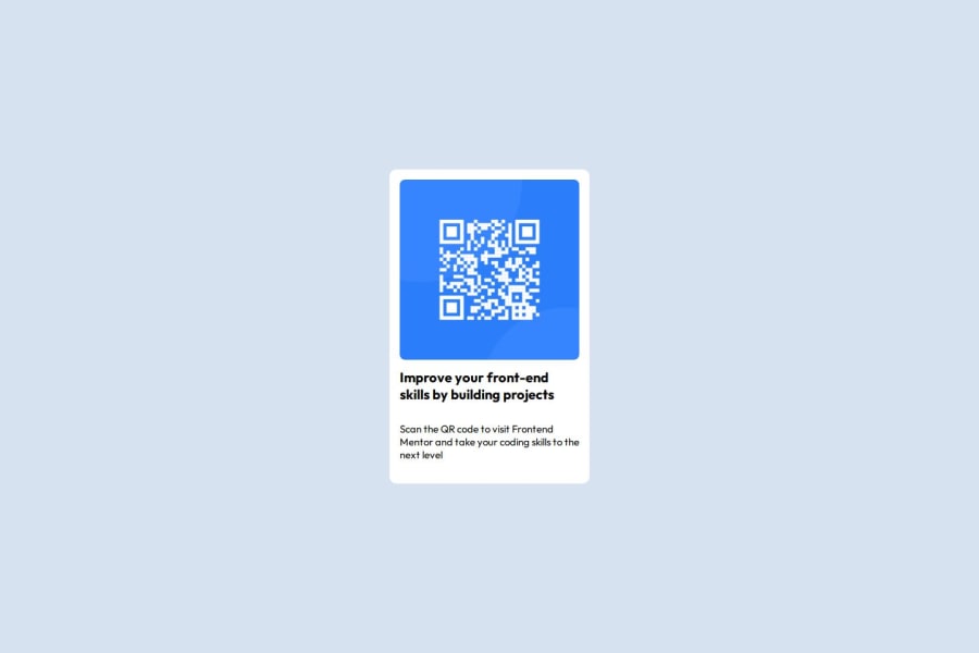
Design comparison
Solution retrospective
What I’m Most Proud Of
-
Clean Layout and Design: I successfully implemented a visually appealing layout that closely matches the design provided by Frontend Mentor.
-
Improved CSS Skills: I gained confidence in using CSS properties like
border-radius,padding, and layout techniques. -
Project Completion: I’m proud to have completed the challenge and learned new techniques along the way.
What I Would Do Differently
Add Media Queries: I would enhance responsiveness by adding media queries to better adapt the design to different screen sizes.
What challenges did you encounter, and how did you overcome them?Challenges I Encountered and How I Overcame Them
Challenge:I initially wanted to use only the box model to structure the layout, avoiding modern layout techniques like Flexbox. However, aligning and centering the elements within the container using just the box model proved difficult. I found it challenging to achieve the desired vertical and horizontal alignment across different screen sizes.
How I Overcame It:After experimenting with the box model, I decided to use Flexbox for centering the content within the container. Flexbox made it much easier to align elements both vertically and horizontally, while maintaining a clean and responsive layout. This switch helped me save time and produce a more consistent result, even though it meant stepping away from my original intent of using only the box model.
What specific areas of your project would you like help with?Specific Areas I’d Like Help With
I would really appreciate help with understanding Flexbox more deeply. While I used it for centering elements in my layout, I’m still not fully confident in how to apply its full range of capabilities. Specifically, I would love more clarity on:
-
Flexbox Container Properties: How to effectively use properties like
justify-content,align-items, andflex-directionto create flexible and responsive layouts. -
Flexbox Item Alignment: Understanding the different ways to align individual flex items within the container, particularly in more complex layouts.
-
Flexbox vs Grid: When to use Flexbox vs CSS Grid, and how to determine which one is best suited for different layout scenarios.
Any guidance or resources that explain these concepts in detail would be greatly appreciated!
Community feedback
- @Grimm-NPosted 5 months ago
You're doing awesome! Your effort and attention to detail really shine through—keep it up! 🌟
Here are a couple of tips to take your work to the next level:
1️⃣ Instead of using pixels, consider using
em,rem, or%. Why? They adapt better to different screen sizes, making your design more responsive and user-friendly across devices. 🚀2️⃣ Always assign classes to your elements! This makes your code easier to manage and avoids confusion. Following the BEM (Block-Element-Modifier) methodology can make it even better. For example:
<div class="button button__icon button__icon--active"></div>With BEM, your code stays neat, scalable, and easy to update. Trust me, future-you will thank you! 💡
Keep going—you’re making amazing progress! 🙌🎉
Marked as helpful2@AdhizahPosted 4 months ago@Grimm-N Thank you so much for your kind words and encouragement! It means a lot to me and motivates me to keep improving. 🌟
I truly appreciate the tips! Switching to em, rem, or % for better responsiveness is such a great suggestion—I’ll start implementing that right away. 🚀 Also, your advice on using BEM for cleaner, more scalable code is super helpful. The example you provided makes it so clear, and I can already see how much easier it will make managing my code in the future. 💡
Thanks again for taking the time to share these tips and for your support—it’s incredibly motivating! 🙌🎉
0
Please log in to post a comment
Log in with GitHubJoin our Discord community
Join thousands of Frontend Mentor community members taking the challenges, sharing resources, helping each other, and chatting about all things front-end!
Join our Discord
