Design comparison
Solution retrospective
This was my first time using Figma for design specs so I'm proud I was able to figure out how best to use it. Now that I'm more familiar with its capabilities I'd like to use it to figure out the dimensions of all of the design components before I start working on them to avoid needless adjustments.
What challenges did you encounter, and how did you overcome them?Needing to fill the page so I could center a relatively small component wasn't something I've needed to do in a project before but by setting height for the html to 100% in the CSS I was able to give myself more space in a way that was new to me.
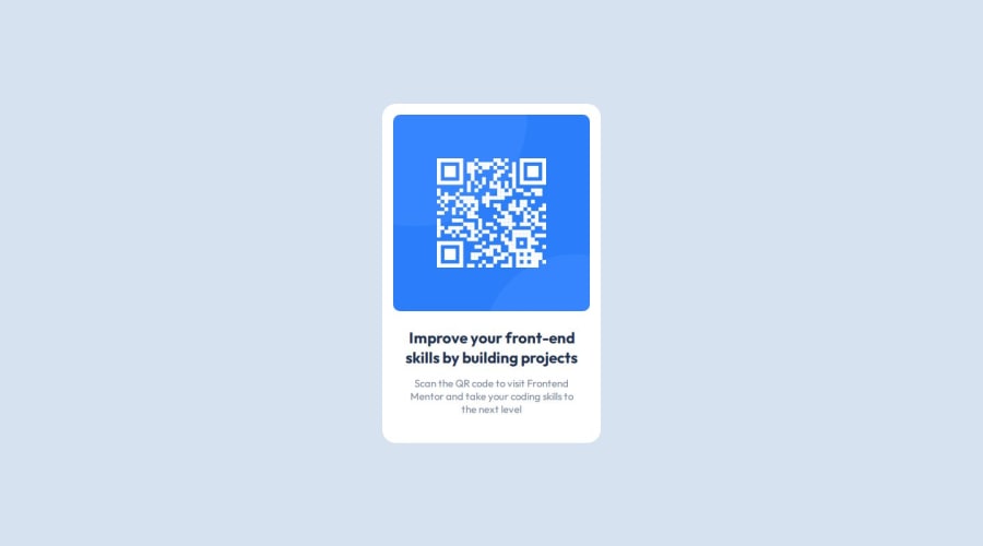
The only thing I'm uncertain on is if I correctly positioned the text components relative to the QR code image. I'm fairly certain I've got all the dimensions correct but I'm not sure how to check if the position is okay.
Community feedback
- @bob2buildPosted 11 months ago
The font size in the specification doesn't seem to match the size in figma. When I opened the figma file, the font details were missing
0
Please log in to post a comment
Log in with GitHubJoin our Discord community
Join thousands of Frontend Mentor community members taking the challenges, sharing resources, helping each other, and chatting about all things front-end!
Join our Discord
