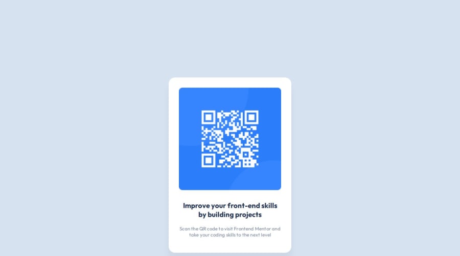
Design comparison
SolutionDesign
Solution retrospective
What are you most proud of, and what would you do differently next time?
While working on this project, I significantly improved my understanding of responsive design, especially using Flexbox.
This project also reinforced the importance of mobile-first design and how to effectively use media queries to adapt the layout for larger screens.
What challenges did you encounter, and how did you overcome them?was more difficult to understand media queries
What specific areas of your project would you like help with?I had some issues with my GitHub Pages site because my CSS seems to not be applied . I got a solution using cloudflare
Community feedback
Please log in to post a comment
Log in with GitHubJoin our Discord community
Join thousands of Frontend Mentor community members taking the challenges, sharing resources, helping each other, and chatting about all things front-end!
Join our Discord
