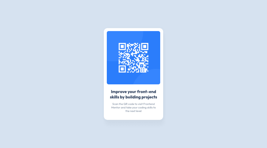
Design comparison
Solution retrospective
Feedback welcome!
Was there another/better way to make the last div stick to the end of the page?
Thanks!
Community feedback
- @vikramviPosted almost 3 years ago
Can you please clarify without using height property how did you make image size matching as per design ?
I couldn't find height being set either for .qr-card or img
----- Adding below as short feedback / answer is not allowed here :)
Does the solution include semantic HTML? - NO Is it accessible, and what improvements could be made? - NO Does the layout look good on a range of screen sizes? - YES Is the code well-structured, readable, and reusable? - YES
1@MariusHorPosted almost 3 years ago@vikramvi Hi, the sizes were not defined in this project so I made everything by eye. I have only set a width to the card container which is the parent container of the image and then I have set
max-width: 100%on the image which tells the image to only grow as wide as its parent container at most and not more than this. You don`t need to specify a height on the image because doing so will mess with the ratio of the image size.So in my design I let the parent container control the size of my image and this is better because if the container grows in size then the image will do that as well and everything will look proportional.
I am still learning myself but what I have found helpful in having a decent understanding of how things work is to know how the box model works, how and where to use
paddingandmargin.0
Please log in to post a comment
Log in with GitHubJoin our Discord community
Join thousands of Frontend Mentor community members taking the challenges, sharing resources, helping each other, and chatting about all things front-end!
Join our Discord
