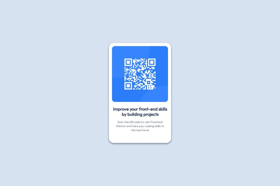
Design comparison
Solution retrospective
I like the final look of the page. I used the inspect element functionality of the browser to figure out why some margins looked off, which was a first for me.
What challenges did you encounter, and how did you overcome them?I am not quite happy with the shadow i applied around the card, but i couldn't figure out a solution that was closer to the original. In the end i decided to use a strong shadow which is definitely different from the original design, but it still looks good in my opinion.
I was not aware that the body element does not take up the entire page height by default, which led to some confusion in the beginning. But using CSS to set the height of the and the element to 100% solved that problem for me.
What specific areas of your project would you like help with?I am hoping for feedback on the HTML tags I used to structure the component - I read about semantic html and am wondering if there are more suitable alternatives for the elements I used.
I feel like the different sections/classes got a bit lengthy, so there might be some optimization potential? I also wonder if using a @media query would have been useful/necessary here for responsive design? I am also uncertain about the width of the card. I used a fixed width, but i feel like there are probably other, better options.
I am still very new to CSS, so any feedback would be welcome. Same goes for the HTML, really :D
Community feedback
Please log in to post a comment
Log in with GitHubJoin our Discord community
Join thousands of Frontend Mentor community members taking the challenges, sharing resources, helping each other, and chatting about all things front-end!
Join our Discord
