

Design comparison

Solution retrospective
It's been awhile since I did web development using pure HTML and CSS, and I'm proud of what I could create. I'm really proud of the overall design of the div box and, the margins and padding of it. I'm surprised I handled the CSS well this time, although I had to do some research to get the results that I wanted.
Improvements
- Optimise CSS and HTML (if possible)
- Understand the basic functions and properties of CSS
- Try to minimise the use of Google or other websites for assistance (learn from experience)
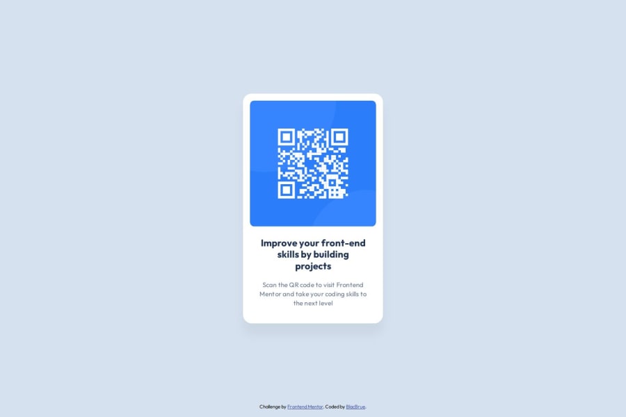
I struggled with the margins between the title text and the caption as they were a few pixels off compared to the original design picture. Didn't manage to mitigate it so I just let it be. I was also struggling on the box shadow of the div box. My solution was using a Figma plugin that converts a layer's shadow into CSS At first, I also struggled trying to fit the QR Code image into the box div. After some research and browsing on StackOverflow, I got my answer and fixed the issue.
What specific areas of your project would you like help with?I would like to know how I could reduce the margin between the bolded title text and the caption. Other than that, I think everything else checks out. Do leave feedback on the overall design/technicals of the page though, I'd appreciate it alot.
Community feedback
Please log in to post a comment
Log in with GitHubJoin our Discord community
Join thousands of Frontend Mentor community members taking the challenges, sharing resources, helping each other, and chatting about all things front-end!
Join our Discord