Design comparison
Community feedback
- @Jair117Posted 4 months ago
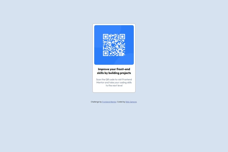
The layout doesn't look very good on mobile screens. inta use relative units (rem o %) instead of px. To make the page adapt to various devices you can use media query. You can use global selectors to set the font and thus avoid repeating them, for exemplo * {font-family: Outfit, Arial, Helvetica, sans-serif};.
0 - @JoelBuenrostroPosted 4 months ago
Hi, your QR component looks good, perhaps as a suggestion you could adjust the size of your card to 320px wide and 497px high so that it is exactly the same size for desktop and mobile screens.
0
Please log in to post a comment
Log in with GitHubJoin our Discord community
Join thousands of Frontend Mentor community members taking the challenges, sharing resources, helping each other, and chatting about all things front-end!
Join our Discord
