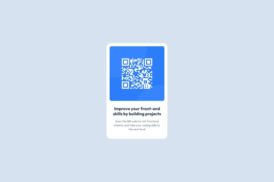


Design comparison

Community feedback
- @Satjeet2005Posted 2 months ago
Hi there! In a friendly manner: The design does not look good on small mobile screens(320px) rest is good
Marked as helpful0P@huynhvanngoanPosted 2 months ago@Satjeet2005 Thank you for taking the time to review and comment on my solution. I will check again and edit again soon. Wish you a good day!!!
2@Satjeet2005Posted 2 months ago@huynhvanngoan Hey how you have came to perfect pixel values because making design from seeing a screenshot is quite different from a actual website. Looking forward to learn from you.
Marked as helpful1P@huynhvanngoanPosted 2 months ago@Satjeet2005 Because I'm just learning frontend, I use figma files to code, not images. I think with more experience, when you look at the sample, you can guess the size, but it can't be exact.
1 - @alaa-mekibesPosted 2 months ago
Perfect pixel good job 🎉 just :
-
Update Your README File Start by using the provided README template included in the starter file. Customize it to enhance clarity and professionalism.
-
Use semantic HTML elements for better structure and accessibility. For example:
<body> <main> <!-- Your code --> </main> </body>- I recommend Avoiding Using px Unless Necessary.
Great job so far, keep pushing forward, you're doing amazing!
Marked as helpful0P@huynhvanngoanPosted 2 months ago@alaa-mekibes Thank you for taking the time to review and comment on my solution. I will take note of this and try to do better in the next challenges. Have a good day!
1 -


Please log in to post a comment
Log in with GitHubJoin our Discord community
Join thousands of Frontend Mentor community members taking the challenges, sharing resources, helping each other, and chatting about all things front-end!
Join our Discord