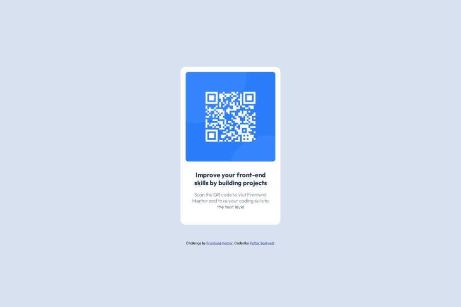
QR Code Component using HTML and CSS


Design comparison

Community feedback
- P@Islandstone89Posted 3 months ago
Hi Petter, nice to see a fellow Norwegian here!
You did a good job on this challenge - here are a few suggestions to make your solution even better:
HTML:
-
The alt text must also say where it leads(the frontendmentor website). A good alt text would be "QR code leading to the Frontend Mentor website."
-
I would change the heading to a
<h2>- a page should only have one<h1>, reserved for the main heading. As this is a card heading, it would likely not be the main heading on a page with several components. -
Change
.attributionto a<footer>, and use<p>for the text inside.
CSS:
-
It is best practice to write CSS in a separate file, often called
style.css. Create one in the same folder as theindex.html, and link to it in the<head>:<link rel="stylesheet" href="style.css">. -
Including a CSS Reset at the top is good practice.
-
Since Outfit is a sans-serif font, you must change
font-family: 'Outfit', seriftofont-family: 'Outfit', sans-serif. -
I recommend adding a bit of
padding, for example16px, on thebody, to ensure the card doesn't touch the edges on small screens. -
On the
body, changeheighttomin-height: 100svh- this way, the content will not get cut off if it grows beneath the viewport. -
Remove the
widthinpxon the card. We rarely want to give a component a fixed size, as we need it to grow and shrink according to the screen size. -
We do want to limit the width of the card, so it doesn't get too wide on larger screens. To solve this issue, give the card a
max-widthof around20rem. -
font-sizemust never be in px. This is a big accessibility issue, as it prevents the font size from scaling with the user's default setting in the browser. Use rem instead. -
Since all of the text should be centered, you only need to set
text-align: centeron the body, and remove it elsewhere. The children will inherit the value. -
On the image, add
display: block,height: autoandmax-width: 100%- the max-width prevents it from overflowing its container. Without this, an image would overflow if its intrinsic size is wider than the container.max-width: 100%makes the image shrink to fit inside its container.
Marked as helpful1P@PetterTSaatvedtPosted 3 months ago@Islandstone89 Hei Øystein, tusen takk for masse bra feedback!
Her er det mye jeg skjønner at jeg har oversett i lengre tider, fordi det "funker" på min skjerm. Spesielt bruken av korrekte units, og håndtering av bildestørrelse-skalering er noe jeg kommer til å få god bruk for fremover.
Skal sørge for at jeg tar all feedback med i betraktning i neste prosjekt - igjen takk for hjelpen!
1 -
- T@PhillipDaumPosted 3 months ago
Your code seems well organized. The preview looks good. I like how you included alt text for the image, I forgot that in mine. I also found it interesting how you applied the width of 288px to the qr-card class and it worked for everything. I'm going to research your use of rem and em a little bit because it seemed to work well. I don't completely understand the difference.
1P@Islandstone89Posted 3 months ago@PhillipDaum
remrelates to the root font size, which by default is16px. If a user change their default font size in the browser, afont-sizeset inremwill scale, whereas it will not scale if it's set inpx. This is why it's crucial to never usepxforfont-size.The
emunit is relative to the font size of the element's parent. If no explicit font size is set on any of the element's ancestors,1emis equal to the root font size, which as mentioned is16pxby default.Here's a a reason why I prefer
removeremfor font sizes. Let's say you have the following HTML:<div class="parent"> <p class="child">I'm a paragraph.</p> </div>With these styles applied:
.parent {
  font-size: 2rem;
}

.child {
  font-size: 1.5rem;
}
What would the computed font size(font size always gets computed to a
pxvalue) be for each of the elements?Well, we haven't changed the font size on the root(
html), so by default1remis equal to16px. This means.parenthas a computed font size of16px * 2=32px.For the
.child, we multiply16px * 1.5, which gives us24px.Now, let's look at the same style rules, using
em:.parent { font-size: 2em; } .child { font-size: 1.5em; }The
.parentstill gets a computed font size of32px, since1emequals16pxif no font size is set on any elements besides the root. But, in this example,.childdoes not get a font size of24px. How come? Because its value is relative to its parent,1.5gets multiplied by32pxand not16px. Hence,.child's final font size value is32px * 1.5, which is48px.Hopefully this made some sort of sense :)
1P@PetterTSaatvedtPosted 3 months ago@PhillipDaum Thanks for the feedback, Phil! Alt text is crucial for providing descriptions of an image/figure (and its function if it redirects somewhere) so that it is possible for impaired users using a screen reader to access the content! :-)
For the width set on the qr-card, I did this purely to get as near the design of the component as possible, however as Øystein pointed out it would be better to not set a fixed size, but rather set a max-width, to make it possible for the component to shrink or grow according to screen sizes.
2T@PhillipDaumPosted 3 months ago@Islandstone89 That made so much sense! Excellent. Thank you!
1


Please log in to post a comment
Log in with GitHub
Join our Discord community
Join thousands of Frontend Mentor community members taking the challenges, sharing resources, helping each other, and chatting about all things front-end!
Join our Discord