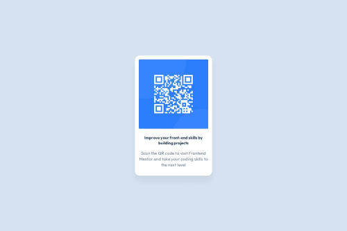
QR code component using HTML and CSS

Solution retrospective
I am proud of the structure of the CSS, using :root. It has helped to organise the CSS and make it easier to add code for various elements.
What I would do differently next time is spend more time at the start, understanding what the project consists of.
Next time I would use my notes and examples less, and not be scared to make errors.
What challenges did you encounter, and how did you overcome them?My initial challenge was understanding where to start. It was daunting at first, but helped to break down each component. Once I understood the individual elements, I was able to see how I could code them.
I had trouble with the box models, and arranging the elements. I overcame this by remembering to start from the biggest, and work my way to the smallest, elements. I started with the body, and worked my way down.
What specific areas of your project would you like help with?I would like help to ensure that the code is responsive.
I would also like any feedback as to how it can be improved.
Please log in to post a comment
Log in with GitHubCommunity feedback
No feedback yet. Be the first to give feedback on ThisIsArti's solution.
Join our Discord community
Join thousands of Frontend Mentor community members taking the challenges, sharing resources, helping each other, and chatting about all things front-end!
Join our Discord