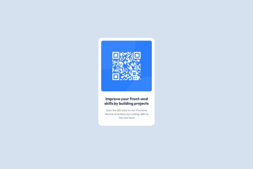
QR code component using html and css

Solution retrospective
Most proud of the completion of the project.
What challenges did you encounter, and how did you overcome them?-
Margins and paddings were confusing at first, but by using Google DevTools, hovering on the computed panel, makes it easier to understand and debug
-
Figuring how to center the QR Code card component inside the body. Tried multiple solution from stack overflow, for eg. margin: auto, which only centers horizontally and other solutions like
body {
   display: flex;
   justify-content: center;
   align-items: center;
}
Stumbled on adding height:100vh, which seems to fix the issue.
What specific areas of your project would you like help with?I need to work on my understanding of the display property and viewport unit. Would also appreciate some feedback on my coding style!
Please log in to post a comment
Log in with GitHubCommunity feedback
No feedback yet. Be the first to give feedback on Ken's solution.
Join our Discord community
Join thousands of Frontend Mentor community members taking the challenges, sharing resources, helping each other, and chatting about all things front-end!
Join our Discord