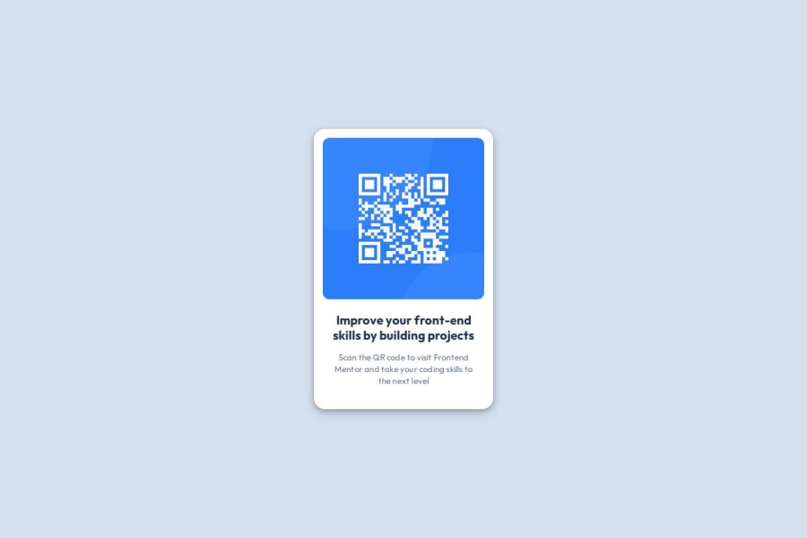
Design comparison
Solution retrospective
What I'm proud of is that I completed this project using only the knowledge I currently have without the help of AI. For my next challenge I will be careful in deciding what tags to use in order to have a readable and structured html code.
What challenges did you encounter, and how did you overcome them?There's not much challenge I counter during making the project. I only forgot the tags and how to use them since I stop learning front end for a year. Before I take the challenge I did some reading in w3schools and watch tutorials in YouTube to refresh.
What specific areas of your project would you like help with?- Using flexbox property
- Proper usage of flexbox property
- Proper usage of html tags
Community feedback
- @grace-snowPosted about 2 months ago
Hi, well done on getting this close to the design! However there are a few problems here and some general learning points to pick up. I hope this helps.
- First minor HTML tips. When building out a single component demo like this try to think of it as you would in a real project, as if you're building it to be dropped into a real site. This is a card component. It would never be the main landmark or serve the main title (heading) of a page. That tells you too things: This needs to be a div/article/section inside the main landmark, probably with its own class for styling, and the heading should be a lower importance level like h2.
- Also think through the alt text. What if this component is used multiple times on a page? "QR code" isn't descriptive enough as the img alt text. It needs to say what the image is (QR code) and where it goes (to FrontendMentor.io).
- get into the habit of including a full modern css reset at the start of the styles in every project. Andy Bell or Josh Comeau both have good ones you can look up and use. This has problems due to that missing reset (explained next).
- The img must not have a width and height in css. All.it needs for the sizing is what's already included in the css reset :
display: block; max-width: 100%;
. In this case it would be good to give it an aspect-ratio property too so the browser knows to save the right space for it as it loads (good for performance). - This solution currently breaks at some screen sizes like small mobile landscape because you have limited the height of the body. Don't limit the height of any elements that contain text, including the body. Instead, give it a min-height: 100svh. Using min height instead of height there is an important distinction. You want to tell the browser to make the body at least as tall as the screen (not exactly as tall as the screen, which creates problems when that content can't fit into the height!).
- The card should not have a width. Use max-width instead and make this in rem not px. You can optionally give it width 100% too but no explicit width. That's another important distinction. You want to tell the browser "don't let this go wider than the limit I've set, but let it go narrower if it needs to, like if it can't fit in the available width". And using rem is good there because it means the layout will scale correctly for all users including those who have a different text size setting in their browser or device.
- it's very important to never set font size in px. Use rem instead. I've written a full post about why this matters.
- this component should never hit the screen edges. Add a little spacing so that can't happen. The simplest way to do that here is probably just adding a little padding in px to the body.
- Don't nest css selectors unnecessarily. All that does is increase css specificity, making it harder to maintain and harder to read. Use single class selectors wherever possible.
Marked as helpful0@devmorkPosted about 2 months agoThank you for your helpful feedback. I'm going to take note of the feedback and be sure to apply on the next solution I will submit.
0@grace-snowPosted about 2 months ago@devmork you need to refactor this and existing solutions, don't wait for the "next" one.
0@devmorkPosted about 2 months ago@grace-snow Okay I will and also how can I get in touch with you in discord so I can get a feedback with you.
0 - @dvgldevPosted about 2 months ago
It seems to me that the box shadow is different from the one in the layout, but the work is excellent, there is nothing to complain about. Probably the author added his own twist ;)
0
Please log in to post a comment
Log in with GitHubJoin our Discord community
Join thousands of Frontend Mentor community members taking the challenges, sharing resources, helping each other, and chatting about all things front-end!
Join our Discord