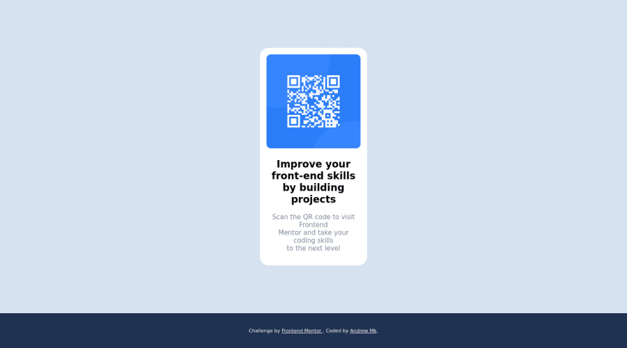
Design comparison
Solution retrospective
I found it difficult to use the whole page in order to center the component.
Community feedback
- @DrMESAZIMPosted over 2 years ago
hi Andrew ..
To center the component better . Here are some to changes I did after I downloaded your code .All my work was focused on the CSS code
1.Index.html file remove line 33
2.Index.html file line 48 > width:40% ;
3 index.html add .container { height:50%}
4.index.html set img{ width:70%; border-radius: 10px;height: 80%; }
- index.html line 65 add div > p { font-size: 0.8rem; line-height: 1.5; }
6 .index.html line 93 replace the media query with this new media query
  @media screen and (min-width: 550px) {

.container {height: max-content; width: 25%; }

 img {width:90%; border-radius: 10px; height: 30vh; }

  }
Marked as helpful0 - @bradleyhopPosted over 2 years ago
I found this article to be very helpful on centering: https://css-tricks.com/centering-css-complete-guide/ For my solution, I followed the guideline under centering vertically & horizontally, with the element of being a fixed width and height.
I'd extend the width of your qr component card so that the text flows better. I do like how the color of the footer complements the color scheme. Great job overall!
Marked as helpful0
Please log in to post a comment
Log in with GitHubJoin our Discord community
Join thousands of Frontend Mentor community members taking the challenges, sharing resources, helping each other, and chatting about all things front-end!
Join our Discord
