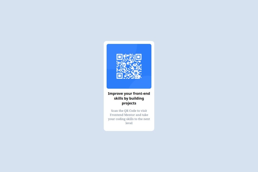
Design comparison
Solution retrospective
proud that i tried my absolute best to replicate the QR code component webpage and would try to pay attention to the details and designs used on the pages next time.
What challenges did you encounter, and how did you overcome them?Font styles and designs used in the page, and how to center a Div. I overcame the challenges by trying multiple styles, colors and designs till i got it right.
What specific areas of your project would you like help with?The DESIGNS and how to center a . I NEED HELP WITH CSS FLEXBOX.
Community feedback
- @dylan-dot-cPosted 5 months ago
Hey, well done! I can help you!!😅
You don't need to experiment with colors as this is a free+ challenge and you can get the Figma file for free!
Try not to use %s in your css code, you'll have less control on different screen size, make sure you download the Figma file and inspect it, you'll see all the paddings, margins and etc
You also should make the h3 a h1, since you should use them in order h1,h2,h3 if you want a smaller size, just use css it visually change that. Each webpage should only have at most/least 1 h1 tag so that's a good thing to remember generally.
To center your div, use flex box and make sure your container has a reasonable height, if it's the body it should be 100vh. Use this code
body {
    ....// Your code you already have
    height: 100vh;
    display: flex;
    justify-content: center; //align it horizontally
    align-items: center; //aligns it vertically
}
You could also checkout the flex box tutorial at css tricks, it's really good! Css Tricks Flexbox
Ps. Pleas emake sure you compete the documentation in the readme template file, it helps improve your documentation skills and it helps others that come to your repo see what you've done and what you have learned also show what you know you could have done better, this helps personal reflection and helps you improve on those and not forget about them. I also did this challenge so you can check it out as well
Marked as helpful1@mamman-nafPosted 5 months ago@dylan-dot-c Thank you very much for taking the time to review my work. I am delighted on the observations you made and I will ensure to make corrections on the suggestions you made. Please do keep guiding us.
Much Appreciated.
1@dylan-dot-cPosted 5 months ago@mamman-naf No worries! I'm always delighted to contribute to the community and help others improve. I'm no expert but I try my best as I am still learning as well.
Take care, continue working hard!
0@mamman-nafPosted 5 months ago@dylan-dot-c have worked on the suggestions u made. can u please cross check it and see if there is anything i need to improve. sorry to bother u.
1@dylan-dot-cPosted 5 months ago@mamman-naf It's not a bother bro.
- You forgot to use the font specified in the
style-guide.mdfile. You can import it from google docs using@importin css or use the@font-faceselector and use the file provided(if there is one). You can then use it on the body for all children text(what I normally do) like
@import url("https://fonts.googleapis.com/css2?family=Outfit:wght@100..900&display=swap");

body {
    font-family: "Outfit", sans-serif;
}
you can also change the color for the h1 text as it's kinda close, just check in the style-guide and you can test the colors there. As always, you can look at my code and see how I did things you aren't certain of.
Take care bro!
Marked as helpful0@dylan-dot-cPosted 5 months ago@mamman-naf also don't forget to generate a new screenshot when you update your code
0 - You forgot to use the font specified in the
Please log in to post a comment
Log in with GitHubJoin our Discord community
Join thousands of Frontend Mentor community members taking the challenges, sharing resources, helping each other, and chatting about all things front-end!
Join our Discord
