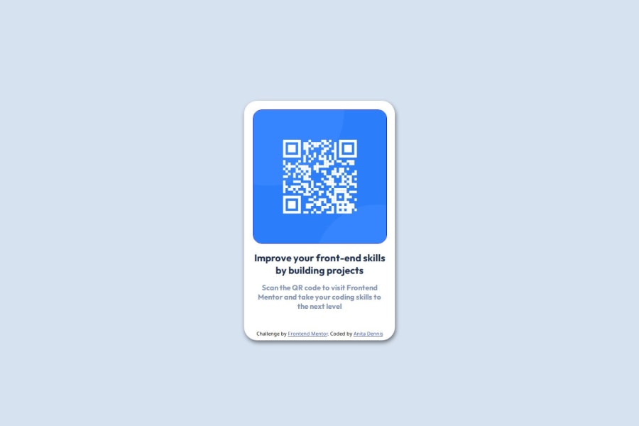
Design comparison
Solution retrospective
I'm proud of the fact i could easily add color and border radius and the simple stuff. Initially i struggled to center the QR code in the screen and make it adjust if the window is being resized, i added the margin in pixels instead of making it auto but a friend corrected me on that and next time i would consider that in my future projects.
What challenges did you encounter, and how did you overcome them?The first problem i encountered was using GitHub, i could not understand how to add files from my local machine to an existing repository but i read the article on that which was a link in the readme template, it took me minutes but i finally had a grasp of what it does, i don't fully understand it but i am sure if i continue to learn ill be really good at it in no time. second problem was hosting the project, i encountered a lot of problems, from not knowing what i was doing, to getting errors while trying to publish it, i used GitHub pages and it had a documentation on how to use it and i clicked on it and it didn't take me too long to understand it.
What specific areas of your project would you like help with?- hosting
- GitHub pages
- Creating a repo locally from my machine
- using markdown language
Community feedback
Please log in to post a comment
Log in with GitHubJoin our Discord community
Join thousands of Frontend Mentor community members taking the challenges, sharing resources, helping each other, and chatting about all things front-end!
Join our Discord
