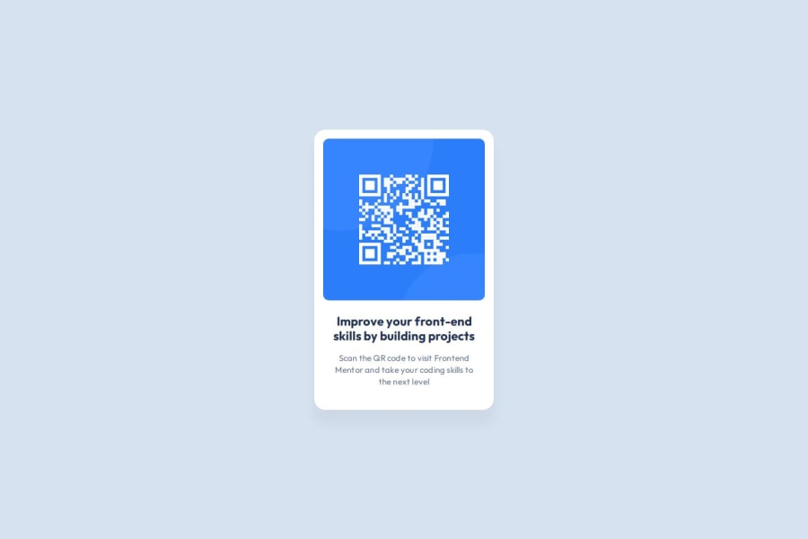
Design comparison
SolutionDesign
Solution retrospective
What are you most proud of, and what would you do differently next time?
I proud with my solution, is my first component that build alone. Next time I want to improve my syntax and maybe use a CSS framework.
What challenges did you encounter, and how did you overcome them?i had problems with the measures of design, although with the figma design help me and used my instinct resolve the challenge
What specific areas of your project would you like help with?I need help for improve my syntax and undertand the web designs,
Community feedback
Please log in to post a comment
Log in with GitHubJoin our Discord community
Join thousands of Frontend Mentor community members taking the challenges, sharing resources, helping each other, and chatting about all things front-end!
Join our Discord
