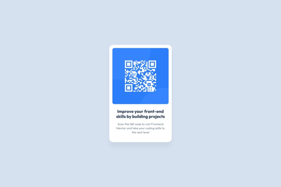
Design comparison
Community feedback
- P@BigO-DevPosted 11 months ago
Review of HTML/CSS Code
1. Semantic HTML
Assessment: The provided HTML code is quite simple and does not make extensive use of semantic HTML elements. It primarily uses
<div>elements for layout, which are non-semantic. While this is sufficient for a simple project like this, using more semantic elements could improve accessibility and the overall structure of the document.Suggestions for Improvement:
- Replace
<div>tags with semantic HTML5 elements where appropriate. For example, wrapping the main content in<main>, using<section>for the card, and<footer>for the attribution. - Using
<header>for any headings or introductory content if added later.
2. Accessibility
Assessment: The code includes some aspects of accessibility such as the
altattribute on the<img>tag, which is good. However, there are areas for improvement.Suggestions for Improvement:
- Ensure that the page is fully navigable via keyboard. This includes making interactive elements like links easily focusable and visibly highlighted on focus.
- Use
aria-labelswhere necessary to provide more descriptive labels for assistive technologies. - Avoid using
overflow: hiddenon the body, as it can cut off content and restrict the page’s navigability with a screen reader or when zoomed in.
3. Responsive Design
Assessment: The layout employs a basic responsive design using flexbox which centers the card and makes the website look good on various screen sizes. However, the fixed width of the card (
250px) may be too small for larger screens or too large for very small devices.Suggestions for Improvement:
- Use more responsive units like percentages or
emfor widths, and consider using media queries to handle different screen sizes more gracefully. - Test the layout on various devices to ensure that the content scales properly and remains accessible and readable.
4. Code Quality
Assessment: The code is generally well-structured and readable. Inline CSS in the
<head>section is well organized, and classes are meaningfully named which is good for maintainability.Suggestions for Improvement:
- Move the CSS to an external stylesheet to clean up the HTML file and further separate content from styling.
- Increase the reusability of styles by grouping common styles together and using more utility classes if necessary.
- Commenting both in HTML and CSS could be improved for better clarity and maintenance, especially for someone else reviewing or working with the code.
Summary
Overall, the code provides a basic, visually appealing QR code component with a decent start on accessibility. The improvements suggested would help make the page more semantic, accessible, and responsive, improving the overall user experience and maintainability of the code.
Marked as helpful0 - Replace
Please log in to post a comment
Log in with GitHubJoin our Discord community
Join thousands of Frontend Mentor community members taking the challenges, sharing resources, helping each other, and chatting about all things front-end!
Join our Discord
