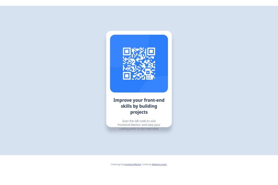


Design comparison

Solution retrospective
I'm proud of remembering the semantic tags for HTML.
What challenges did you encounter, and how did you overcome them?I had challenges with centering the content and making sure the margin and padding worked fine. I also need help with media queries to ensure it works when the browser is resized on a desktop and looks right on mobile.
I also ran into an issue with the .attribution. No matter what size font I entered, the text never changed size. Not sure why this is.
What specific areas of your project would you like help with?I'd like help on better organizing CSS so I'm not using the same things over and over if I don't have to (i.e. using margin: auto for every ruleset).
Community feedback
- @JbugglinPosted 3 months ago
This is a really good start, kudos to finishing it and putting it out there!
You mentioned that the attribution class never changed font size when you specified in the CSS file, I've noticed that in the starter index file, in the <head> there is a styling for the attribution class. That may be the cause to the issue you were having, I try to move that to the style.css file and delete the .
I also noticed that the border radius looks a little off, for the image, take whatever the main card's border radius is and halve it (i.e.: main card border radius is 25px, set the image's border radius to 12.5px), that will make the corner look more consistent.
Check into learning about flexbox, you can set the intrinsic size of the body (width: 100dvw; height:100dvh;) then add in display: flex; justify-content: center; align-content: center;
This will center your main card both vertically and horizontally no matter what screen.
https://www.w3schools.com/csS/css3_flexbox.asp
Another thing that I noticed, that you used px instead of rem/em for the padding, margin, and font sizes. Take a look into using rem/em, for more responsive elements and spacings.
https://www.freecodecamp.org/news/css-units-when-to-use-each-one/
Last thing I'll add, if you set the main card or container width/height, you can size the image this way: img { width: 100%; height: auto; display: block; }
I know that this is a lot, keep at it and keep learning, it'll make more sense and get easier.
Marked as helpful1@melanielogan74Posted 3 months ago@Jbugglin Thank you so much! Flexbox hasn't been the easiest for me, but I will use your recommendations to help with this challenge. I really appreciate the feedback.
1

Please log in to post a comment
Log in with GitHub
Join our Discord community
Join thousands of Frontend Mentor community members taking the challenges, sharing resources, helping each other, and chatting about all things front-end!
Join our Discord