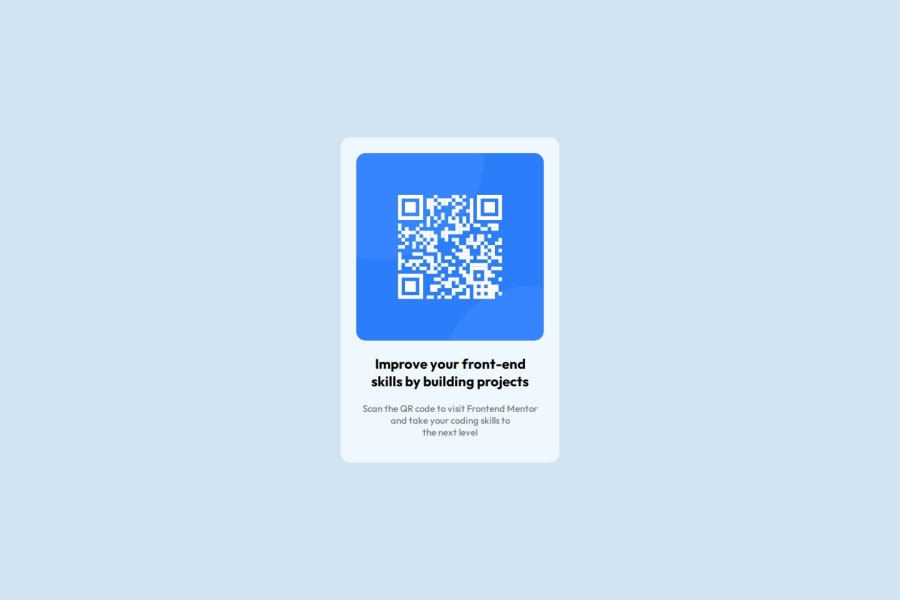
Design comparison
Solution retrospective
I am happy and proud of myself because i can now say i'm out of tutorial hell and i'm on my way to building projects.
What challenges did you encounter, and how did you overcome them?One of the challenge that i encountered was making the website responsive in both large and small screens like mobile.
I had to do some googling and i found out about the media queries and how to use them.
What specific areas of your project would you like help with?I would say "Media querries"
Community feedback
- @Abdullah-trialPosted 6 months ago
Good work
0@abdulkadir023Posted 6 months ago@Abdullah-trial Thank you for your feedback brother, this surely motivates me.
0 - @carlapaesPosted 6 months ago
Hi! :) Some points that I noticed could be improved: card padding, text padding, letter spacing and line height are different from Figma file.
0@abdulkadir023Posted 6 months ago@carlapaes Thanks for your feedback, i'll look into those details the next time.
0
Please log in to post a comment
Log in with GitHubJoin our Discord community
Join thousands of Frontend Mentor community members taking the challenges, sharing resources, helping each other, and chatting about all things front-end!
Join our Discord

