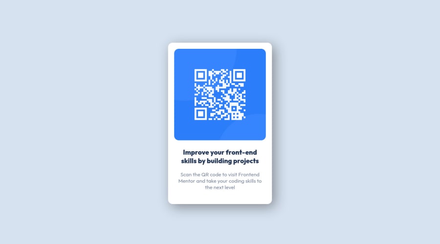
Design comparison
SolutionDesign
Community feedback
- @MelvinAguilarPosted about 2 years ago
Hi @HrHasnai👋, good job on completing this challenge! 🎉
I like this solution for the challenge. Here are a few suggestions I've made that you can consider in the future if you're looking to improve the solution further.
- Use
min-height: 100vhtocontainerselector, with this property you set a height and you let the element grow even more if necessary. Also, remove themargin: 140pxto center correctly.
main { min-height: 100vh; display: flex; . . . } .container { /* margin: 140px */ }- Add an h1 tag to your solution. The
<h1>element is the main heading on a web page. There should only be one<h1>tag per page, and always avoid skipping heading levels; Always start from<h1>, followed by<h2>, and so on up to <h6> (<h1>,<h2>,...,<h6>). The HTML Section Heading elements (Reference)
Solution:
<h1>Improve your front-end skills by building projects</h1>- Instead of using pixels in font size, use relative units of measure like
remorem. The font size in absolute length units (px) does not allow users with limited vision to change the text size in some browsers. Reference.
I hope those tips will help you.
Good job, and happy coding!
0 - Use
Please log in to post a comment
Log in with GitHubJoin our Discord community
Join thousands of Frontend Mentor community members taking the challenges, sharing resources, helping each other, and chatting about all things front-end!
Join our Discord
