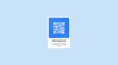
Design comparison
Solution retrospective
Good day everyone. i just summitted a solution to my first frontendmentor challenge. please i'm anticipating your review and feedbacks. thank you
Community feedback
- @MelvinAguilarPosted 11 months ago
Hello there ๐. Good job on completing the challenge !
I have some suggestions about your code that might interest you.
HTML ๐ท๏ธ:
- Wrap the page's whole main content in the
<main>
tag.
- The
<br>
tag is often used to create line breaks, but it doesn't convey any semantic meaning. When a screen-reader reads the text, it will break the flow of reading at the line break tag, which can be confusing for users. More information here. You can usemax-width
withmargin: 0 auto;
- Add an
alt
attribute to the QR code image, explaining its purpose, e.g.,QR code to frontendmentor.io
.
Font ๐ค:
-
It's recommended that you always use the font provided by the challenge's style guide.To import a font, follow the steps below:
- Go to the font's page on Google Fonts: https://fonts.google.com/specimen/Outfit.
- A sidebar will appear with a code snippet that you can use to import the font.
- Copy this code snippet and paste it into the <head> section of your HTML document.
- Now you can use the "Outfit" font in your CSS by specifying
font-family: 'Outfit', sans-serif;
.
CSS ๐จ:
- Prefer
min-height: 100vh
overheight
to prevent component cutoff on smaller screens.
I hope you find it useful! ๐ Above all, the solution you submitted is great!
Happy coding!
Marked as helpful1 - Wrap the page's whole main content in the
- @yozidstPosted 11 months ago
Hi there ๐
Great Job on your first challenge! For implementing the project's font you can do the following:
@import url('https://fonts.googleapis.com/css2?family=Montserrat:wght@500;700&family=Outfit:wght@400;700&display=swap'); // in your styles.css page :root { --ff: "Outfit", sans-serif; } body { font-family: var(-ff); ... }
Hope that helps! Good Luck & fight on!
Marked as helpful0 - @kimodev1990Posted 11 months ago
Really nice work completing the challenge, Just a few feedbacks :-
- There is no need of multiple Div under body, It could be div class content-container under the body directly.
- In the body, you could add
display: flex ; align-items: center ; justify-content: center ; height: 100vh ;
so your div class content-container will be centered in the middle of your website.
Hope you find this Helpful.
Other than that, Really Nice work & keep Going on
Marked as helpful0
Please log in to post a comment
Log in with GitHubJoin our Discord community
Join thousands of Frontend Mentor community members taking the challenges, sharing resources, helping each other, and chatting about all things front-end!
Join our Discord