Design comparison
Solution retrospective
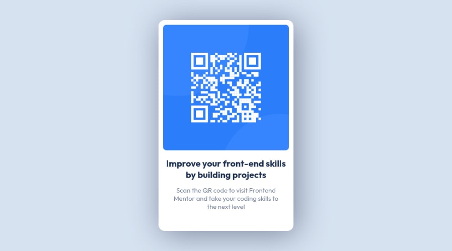
Here is my first challenge of Frontend Mentor.Tell me if somethings wrong here
Community feedback
- @shashreesamuelPosted over 2 years ago
Hey good job completing your first frontend mentor challenge.
Keep up the good work
Your solution looks great however I think that the box shadow on your card needs to be subtle so maybe decrease the value a little bit.
In terms of accessibility issues simply wrap all your content between main tags
I hope this helps
Cheers Happy coding š
0 - @K4UNGPosted over 2 years ago
Hey Kaung, well done on the project. I'd like to point out a few things here
-
you don't need the first media query for
min-width: 375px
. It means your site will break if it gets smaller than 375px. You can just write it directly and then once you get to the screen size where you feel like changing the layout, then you can use the media query to overwrite the properties. -
for the second media query, you have
max-width: 1440px
which is the max screen size in most 1080p monitors which means you're only setting those properties for only that very specific screen size, which seems like a useless move. If you're not sure how media queries and responsive design work, here's a great tutorial to get you started. -
for your
card
, if you want its size to adjust to the screen size, you can give it a width with percentages along with amax-width
. Or you can just keep its size fixed just like you did.
Keep up the good work and Happy Coding!
0 -
- @dtomicicPosted over 2 years ago
Congrats on doing your first challenge š
What I would recommend to you is to stop styling the body element especially with the display attribute, I realize that in this project you didn't have a lot of elements but what I would do is set the main font on body and as for everything else I would set another div that is a parent to your card and then set the background color, display etc on that div. Because it's not a good practice to set styles on the body.
Next I would do is get rid of the media query for
min-width: 375px
as that's not needed you can always start doing the project mobile first and then you won't need to set the min-width for the small screens.All in all for the first project good job :D make sure to keep on learning and making projects
0
Please log in to post a comment
Log in with GitHubJoin our Discord community
Join thousands of Frontend Mentor community members taking the challenges, sharing resources, helping each other, and chatting about all things front-end!
Join our Discord