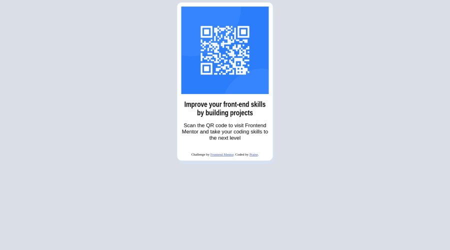
Design comparison
Solution retrospective
Please provide feedback.
What font was used in the original desktop design?
Community feedback
- @visualdennissPosted over 1 year ago
"What font was used in the original desktop design?"
Add this to top of your css file:
@import url('https://fonts.googleapis.com/css2?family=Outfit:wght@400;700&display=swap');
use this inside the body or your card item: font-family: 'Outfit', sans-serif;
Hope you find this feedback helpful!!
Marked as helpful1 - @0xabdulPosted over 1 year ago
Hello there well congrats on completing the Qr code component..
- In Html :
- the html page Must be contained one main landmark
- for easy to use to clear the all Accessibility reports
<body> <div class="qr-card" role="main"> //Whole html code goes here 🏷️ <body>- finnally clear the all Accessibility reports..!
- In Css :
- Accessibility reports clear but some issues on qr code component
- your qr code card is not center aligning so fix the problem ⚠️
body { display:flex; align-items:center; justify-content:center; height:100vh; overflow-x:hidden; }- I hope it's useful for you
- happy code...❤️
0 - @tobezhanabiPosted over 1 year ago
Hi Praise, You did a nice job working with the QR design. Congratulation on submitting a working task. 🎉🎉
Here are a few suggestions to the issue with your solution.
Work on HTML You don't have a landmark, you should replace the
<div class="qr-card card-border">with the <main> and also replace the<div class="attribution">with the <footer>.Landmarks in HTML are structural elements that define the major sections of a webpage. They include semantic elements such as <header>, <nav>, <main>, <article>, <aside>, and <footer>
Hope you find this helpful
Happy Coding😀
0 - @0xabdulkhaliqPosted over 1 year ago
Hello there 👋. Congratulations on successfully completing the challenge! 🎉
- I have other recommendations regarding your code that I believe will be of great interest to you.
HTML 🏷️:
- This solution generates accessibility error reports due to
non-semanticmarkup, which lack landmark for a webpage
- So fix it by replacing the
<div class="qr-card card-border">element with the semantic element<main>in yourindex.htmlfile to improve accessibility and organization of your page.
- What is meant by landmark ?, They used to define major sections of your page instead of relying on generic elements like
<div>or<span>
- They convey the structure of your page. For example, the
<main>element should include all content directly related to the page's main idea, so there should only be one per page
CSS 🎨:
- let me explain, How you can easily center the component.
- We don't need to use
marginandpaddingto center the component both horizontally & vertically. Because usingmarginorpaddingwill not dynamical centers our component at all states
- To properly center the component in the page, you should use
FlexboxorGridlayout. You can read more about centering in CSS here 📚.
- For this demonstration we use css
Gridto center the component
body {
    min-height: 100vh;
    display: grid;
    place-items: center;

    margin: 0;
}
I hope you find this helpful 😄 Above all, the solution you submitted is great !
Happy coding!
0
Please log in to post a comment
Log in with GitHubJoin our Discord community
Join thousands of Frontend Mentor community members taking the challenges, sharing resources, helping each other, and chatting about all things front-end!
Join our Discord
