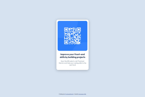
Submitted over 1 year agoA solution to the QR code component challenge
QR-code-component. Using grid [no flexbox]
@temesgen-982

Solution retrospective
What are you most proud of, and what would you do differently next time?
I didn't use the figma file. I didn't want to be dependent on the figma file since you need to be a premium user if you want to access the figma files for all the projects.
What challenges did you encounter, and how did you overcome them?Making the paragraph span 3 lines.
What specific areas of your project would you like help with?Maybe layout alternatives.
Code
Loading...
Please log in to post a comment
Log in with GitHubCommunity feedback
No feedback yet. Be the first to give feedback on Temesgen Adane's solution.
Join our Discord community
Join thousands of Frontend Mentor community members taking the challenges, sharing resources, helping each other, and chatting about all things front-end!
Join our Discord