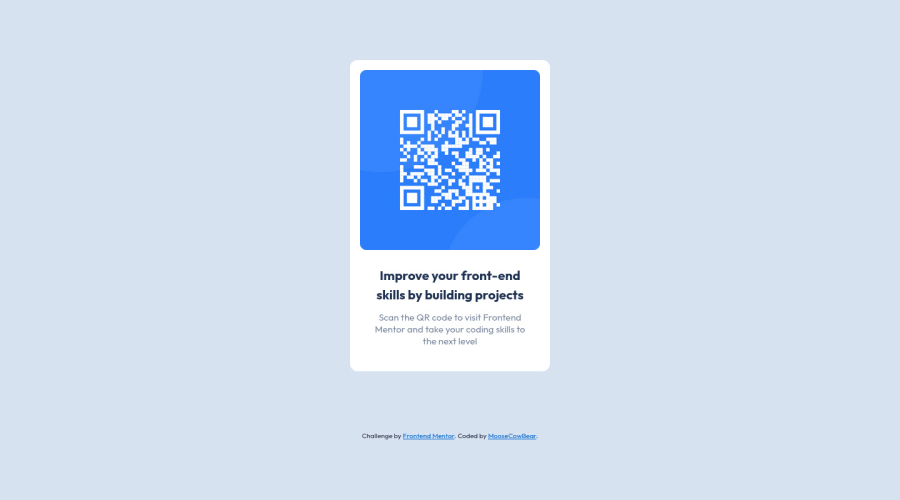
Design comparison
Solution retrospective
I made the body a flex container so that I could center the design, but in order to make the justify-content property have any effect I had to add a height property and I'm not sure why. I presume it has something to do with how the body's height is defined, or maybe not defined. Any clarification would be appreciated. I'm pretty new to this.
Community feedback
- @HassiaiPosted almost 2 years ago
Replace<div class="qr-container">with the main tag, <h3> with <h1> and <div class="attribution"> with the footer tag to fix the accessibility issues. click here for more on web-accessibility and semantic html
To center .qr-container on the page using flexbox, replace the height in the body with min-height: 100vh.
Give .copy a margin value for all the sides, text-align: center and a font-size of 15px which is 0.9375rem, this will be the font-size of both p and h1.
Hope am helpful.
Well done for completing this challenge. HAPPY CODING
Marked as helpful0@MooseCowBearPosted almost 2 years ago@Hassiai Thank you for the tips. Embarrassingly, I wasn't even thinking about accessibility... But I will now.
1 - @KeganFPosted almost 2 years ago
Nice job completing the challenge! 😊
To (hopefully) answer your question: The body and the html elements have a default height of
auto, meaning it will automatically adjust to fit its content. So as you create yourqr-container, the body will change its size so that it is always the minimum height required to display its content. This is why you can't usejustify-content: centerwithout setting a height for the body; it is already vertically centered within the body (because there is no space above or below the container).When you set
height: 100vh, you are overwriting the default ofautoand telling the body to take up 100% of the viewport height. In some cases (especially with mobile devices) this can cause some issues with overflowing, so it is recommended to usemin-height: 100vhinstead, because if any content in the body is larger than the viewport itself, the body will still grow to fit its content properly.An extra piece of advice would be to check out some CSS resets. They help your webpage look the same across different browsers by resetting the default formatting of your webpage, and a lot of them will handle the
min-height: 100vhfor you. I like to use Andy Bell's CSS Reset, but there are many different ones you can try out.I hope this helped!
Cheers! 😀
Marked as helpful0@MooseCowBearPosted almost 2 years ago@KeganF This did answer my question. Thank you so much!
0
Please log in to post a comment
Log in with GitHubJoin our Discord community
Join thousands of Frontend Mentor community members taking the challenges, sharing resources, helping each other, and chatting about all things front-end!
Join our Discord
