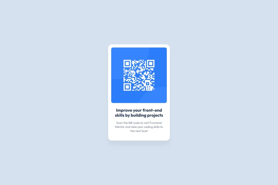
Design comparison
Community feedback
- P@margaux-worksPosted 9 months ago
Hello!
good job in posting your first solution :)
What I noticed:
- you correctly implemented the border radius for the card, but a border radius is missing on your image (see original design provided)
- in order to use semantic html, you could use <main> instead of a simple <div> for the card
- for your text, consider using headings such as <h1> for your main title, so that you are structuring your content effectively.
The last 2 comments would not optimised how your page looks but would be helpful for SEO and accessibility purposes.
Hope this helps!
Marked as helpful0@shubhamr10Posted 9 months agoHi @margaux-works As per your suggestion I tried to improve by using semantic tags. Do check the solution. Thanks
The width might be slightly different.
You can see my solution here: https://www.frontendmentor.io/solutions/responsive-blog-preview-card-YCK-HD2HgF
0 - @FaridiusPosted 9 months ago
The solution effectively includes semantic HTML, enhancing both accessibility and SEO. However, it can be improved by adding meta tags for better accessibility and search engine optimization. The layout is responsive and looks good on a variety of screen sizes. The code is well structured, readable, and reusable, and follows best practices. Additionally, the solution closely follows the original design.
Marked as helpful0
Please log in to post a comment
Log in with GitHubJoin our Discord community
Join thousands of Frontend Mentor community members taking the challenges, sharing resources, helping each other, and chatting about all things front-end!
Join our Discord
