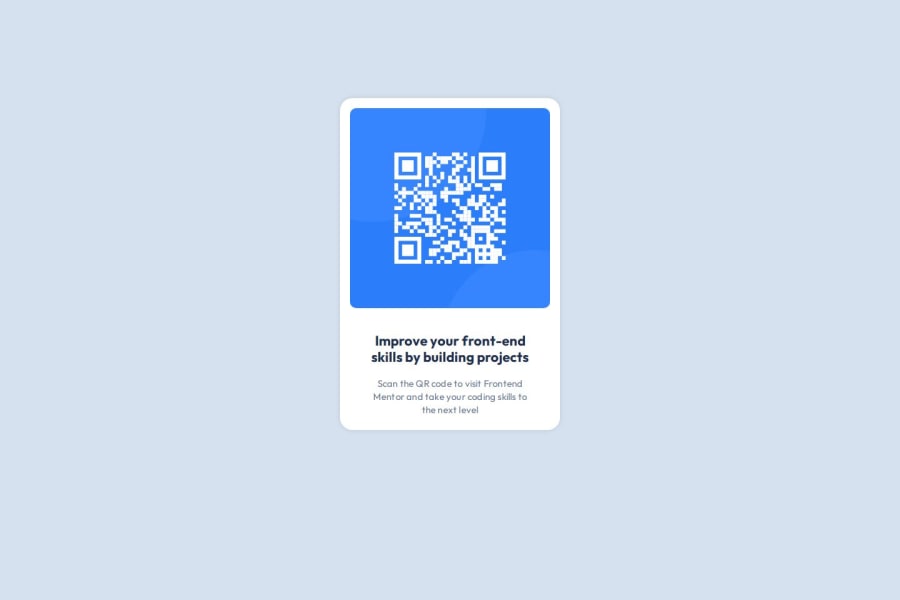
Design comparison
Solution retrospective
As a backend developer, I always have been very bad at layouting a page. Learning Flexbox helped me layouting better than before.
Community feedback
- @ajasmine94Posted 23 days ago
Hello! I can relate to your comment here because I came here being a backend developer. I think you also did a great job on this! The only thing I noticed or could recommend is adding 100vh (viewport height) for the body so that your element / card could be centered with the help of flexbox
Marked as helpful0@sunnyeggPosted 22 days ago@ajasmine94 Hi! Thank you for your feedback and your kind words. I will try 100vh for the next challenge.
0 - @hazhir00Posted 23 days ago
Great design, only thing i can mention is you can give your paragraph a bigger margin.
Marked as helpful0
Please log in to post a comment
Log in with GitHubJoin our Discord community
Join thousands of Frontend Mentor community members taking the challenges, sharing resources, helping each other, and chatting about all things front-end!
Join our Discord