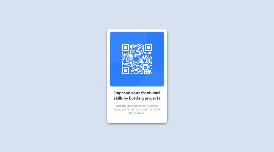
Design comparison
Solution retrospective
Im proud that I was able to finish the project in the same day, I need to get more involve with semantic HTML.
What challenges did you encounter, and how did you overcome them?I did not encounter any challenges.
What specific areas of your project would you like help with?Probably replace the divs with semantics.
Community feedback
- @IngLeonardoPosted 12 months ago
You have put a box-shadow on the card, you are quite heavy with respect to the design, and with respect to the semantics of the html, I recommend that you leave the image within a <section> and within that <section> use a <figure> and within this <figure> the image, that would be the first section and the second section you put the texts.
Marked as helpful0@chrisdinasPosted 12 months ago@IngLeonardo Thanks for the comment, I will take it into account and apply it in the next project.
0
Please log in to post a comment
Log in with GitHubJoin our Discord community
Join thousands of Frontend Mentor community members taking the challenges, sharing resources, helping each other, and chatting about all things front-end!
Join our Discord
