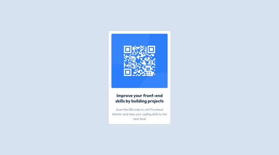
QR Code component using Flexbox and Unsemantic grid framework
Design comparison
Solution retrospective
Hello everyone, Please rate my design
Community feedback
- Account deleted
Hi, Good job 👍
Your design looks perfect 😃. Please also increase the border-radius to make it perfect ✔
Good luck 🍀
Marked as helpful0 - @JoshuaBlick94Posted almost 3 years ago
Thank you, let me implement changes straight away
1 - @NaveenGumastePosted almost 3 years ago
Hay ! Good Job you made it look nearly perfect to the preview
These below mentioned tricks will help you remove any Accessibility Issues
-> Add Main tag after body like it should be your container
-> For 1st heading or h1 tag, use header tag and then inside the header put your h1 or h2 etc
-> But use header tag only once in main heading element.
Keep up the good work!
0 - @ChamuMutezvaPosted almost 3 years ago
Consider using semantic elements such as the
mainelement as stated in the automated feedback. The main element is considered important as that is where the main content of the site should reside. Alt values should be descriptive for the benefit of assistive technology users.0 - @jemeneradevPosted almost 3 years ago
I would round up the corners a bit more, maybe 15px or bigger. The design calls for rounder corners. Also, you might consider reducing the "line-height" property of the paragraph. Good job!
0
Please log in to post a comment
Log in with GitHubJoin our Discord community
Join thousands of Frontend Mentor community members taking the challenges, sharing resources, helping each other, and chatting about all things front-end!
Join our Discord
