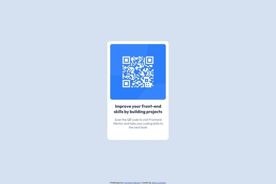
QR Code Component using flexbox and SASS
Design comparison
Solution retrospective
I learned a lot about setting up a project from scratch in one environment and connecting it to a git repo. I gained some solid understanding on how to correctly set up git, conflict resolution, and more about the package.json file and how those dependencies affect my project. It was also a good challenge setting up SASS/browsersync and learning more about how those tools interact.
What challenges did you encounter, and how did you overcome them?Had a bit of a challenge getting SASS set up to compile my styles, ended up being node version conflicts. Also ran into a small hurdle getting my git repo connected to a secondary device, after setting it all up on a different device.
What specific areas of your project would you like help with?Responsiveness? I didn't really see much of a difference between the desktop and the mobile design files, although I may be mistaken here...
Community feedback
- @xNyfPtxPosted 6 months ago
Hi @samlucchese, your code and solution looks good but sadly it has some few issues. Don't worry though as those issues are very easy to fix and are done by everyone learning (including me).
My Tips and Feedback
- Use a code formatter such as Prettier to make your code more readable. Those indentations in your .scss file is nasty.
- Don't use Sass if you aren't even using the features of it. Nesting is already supported by most browsers and it seems like that is the only reason why you are using Sass.
- Never ever set typography-related properties in px! See why
- Use a CSS reset! What a CSS reset does is that it makes your styles more consistent across devices and you won't have to fight against browser defaults. I reccomend using Andy Bell's or Josh Comeau's CSS reset. I use the second one if you'd ask me.
- Don't declare useless properties like
width: 100%.width: 100%can be useful sometimes but there is no need to set it in the body since it is a block-level element which means it will take up the maximum space possible. - Use
min-height: 100vhinstead ofheight: 100vh. Using height will make it unresponsive and the content will be cut off at smaller screen sizes. Using min-height gives it more room to grow and the content wouldn't be cut off unlike height. - Use the
<img />instead of using a div with a background-image. It may look like the same but it is inaccesible since you don't have alt text for it. Screen readers won't see an image aswell. - Learn to use nesting in CSS better.
- Keep CSS specificity as low as possible. Nesting increases it and it makes your CSS harder to read and harder to override later on. You can mitigate this by using a methodology such as BEM.
Update your code and I will continue the feedback.
Have a nice day and have fun coding!
0@samlucchesePosted 6 months ago@geomydas Thank you very much for your feedback. This is all very helpful and important information. I looked over your notes and made some adjustments, I would appreciate any follow up feedback you have as well. Thank you again.
0
Please log in to post a comment
Log in with GitHubJoin our Discord community
Join thousands of Frontend Mentor community members taking the challenges, sharing resources, helping each other, and chatting about all things front-end!
Join our Discord

