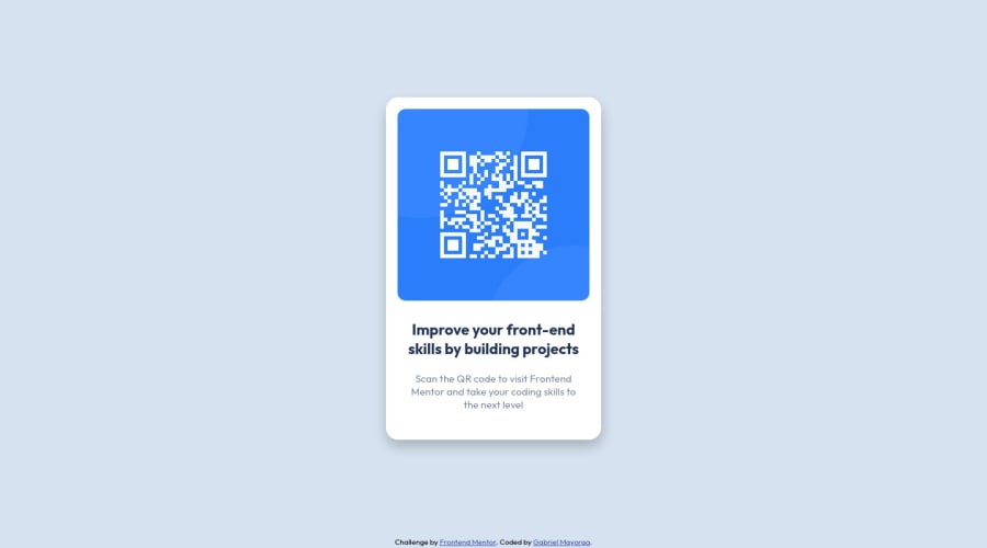
Design comparison
Community feedback
- @MelvinAguilarPosted almost 2 years ago
Hello 👋. Congratulation on successfully completing your first challenge 🎉 ! !
I have some recommendations regarding your code that I believe will be of great interest to you.
HTML 🏷️:
- Use semantic elements such as
<main>and<footer>to improve accessibility and organization of your page.
CSS 🎨:
-
Setting the font-size to 62.5% can attract compatibility issues with third-party libraries or plugins. You can read more about this with this lectures:
- 1. Should I change the default HTML font-size to 62.5%?.
- 2. The Surprising Truth About Pixels and Accessibility - The 62.5% trick.
- 3. A comment on the 62.5% trick.
Credit to grace-snow and vanzasetia.
-
Use
min-height: 98vhinstead ofheight. Setting the height to 100vh may result in the component being cut off on smaller screens, such as a mobile phone in landscape orientation.
I hope you find it useful! 😄 Above all, the solution you submitted is great!
Happy coding!
Marked as helpful0 - Use semantic elements such as
Please log in to post a comment
Log in with GitHubJoin our Discord community
Join thousands of Frontend Mentor community members taking the challenges, sharing resources, helping each other, and chatting about all things front-end!
Join our Discord
