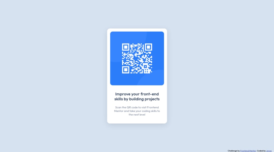
Design comparison
Solution retrospective
This is my solution to the qr code component challenge. Is it ok to use REM for width and height? I made it this way for the design to be larger or smaller depending on the font size chosen by the user. I also didn't put media query, because the size is already good on the phone, in my opinion. Any feedback is welcome! :)
Update 10/26: I've made some code improvements. I removed the picture tag, added a heading, improved the box-shadow and alt attribute, changed the image's border-radius, made the container's padding-bottom larger and now I use REM for fonts only.
Community feedback
- @VCaramesPosted about 2 years ago
Hey there! 👋 Here are some suggestions to help improve your code:
-
The Alt Tag description for the QR image needs to be improved upon. Its needs to tell screen reader users what it is and where it will take them to when they scan it.
-
The "Improve your front-end skill by building projects" needs to wrapped in an Heading Element.
-
The Picture Element is not needed for this challenge as only one image is needed.
If you have any questions or need further clarification, let me know.
Happy Coding! 👻🎃
Marked as helpful0 -
- @WadieBenabdouhPosted about 2 years ago
Great solution Joyce, usually REM units are primarily used for fonts size so I wouldn't recommend using it on layouts, alternatively you can absolutely use EM and percentage% units.
And EXCELLENT work.
Marked as helpful0
Please log in to post a comment
Log in with GitHubJoin our Discord community
Join thousands of Frontend Mentor community members taking the challenges, sharing resources, helping each other, and chatting about all things front-end!
Join our Discord
