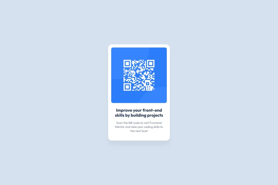
Design comparison
Solution retrospective
What I'm most proud of about my project is how closely the outcome match the original design. If I were to do it again, I would prefer to use SCSS for the project.
What challenges did you encounter, and how did you overcome them?I had forgotten how to use the box-shadow property and how to define css variables. I looked at the css documentation to remember and used them.
What specific areas of your project would you like help with?It would be cool to have someone to review my code and give feedback how to improve it.
Community feedback
- @DanCodeCraftPosted 8 months ago
It's SUPER close to the original. If you intend to ever have an identical copy of it, then you can fix small things:
- the radius of the borders in the QR code itself (it's probably half of what you used)
- the font size on the bottom text
- the margin below the code.
Other than that it's all really good.
Keep up the good work.
Marked as helpful1@mehmeterogulPosted 8 months agoHi @DanCodeCraft I fixed most of things you said. Thank you for the feedback. I think there were also some letter spacing and line height but I'm gonna skip them. I have no screenshots left. 😊
1 - @AshongAbdallah06Posted 8 months ago
It's really well designed. But just a few suggestions. Make use of semantic HTML to make it easy for screen readers.
Change
<div role="main" class="container">...</div>to<main role="main" class="container">...</main>.<div class="text-container">...</div>to<section role="main" class="container">...</section>. You can also put the image into asectiontagLastly change the tag of the attribution to a
<footer>and take it out of the<main>tag.1
Please log in to post a comment
Log in with GitHubJoin our Discord community
Join thousands of Frontend Mentor community members taking the challenges, sharing resources, helping each other, and chatting about all things front-end!
Join our Discord
