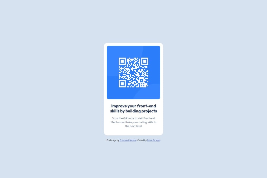
Design comparison
Solution retrospective
I'm must proud that I didn't have to use any pixels and that i also learned how to make variables and custom classes. I feel like I overused flexbox and made it more complicated then needed to be.
What challenges did you encounter, and how did you overcome them?I had an issue with the width not leaving a gap on the mobile device, I used google and found that I needed to use min-height instead of max-height.
What specific areas of your project would you like help with?I would love help with height and width's, I feel like I use them to much.
Community feedback
- @StroudyPosted about 2 months ago
Amazing job with this! You’re making fantastic progress. Here are some small tweaks that might take your solution to the next level…
-
Avoid using
id
selectors for styling in CSS because they are too specific and hard to override, making your styles less flexible and maintainable. Instead, use class selectors (.
), which are reusable and more manageable, allowing for better control over your styles and easier updates. -
Using a
<main>
tag inside the<body>
of your HTML is a best practice because it clearly identifies the main content of your page. This helps with accessibility and improves how search engines understand your content. -
Using a full modern CSS reset is beneficial because it removes default browser styling, creating a consistent starting point for your design across all browsers. It helps avoid unexpected layout issues and makes your styles more predictable, ensuring a uniform appearance on different devices and platforms, check out this site for a Full modern reset
-
Line height is usually unitless to scale proportionally with the font size, keeping text readable across different devices. Best practice is to use a unitless value like
1.5
for flexibility. Avoid using fixed units likepx
or%
, as they don't adapt well to changes in font size or layout.
You’re doing fantastic! I hope these tips help you as you continue your coding journey. Stay curious and keep experimenting—every challenge is an opportunity to learn. Have fun, and keep coding with confidence! 🌟
Marked as helpful0 -
- @MikDra1Posted about 2 months ago
If you want to make your card responsive with ease you can use this technique:
.card { width: 90%; max-width: 37.5rem; }
On the smaller screens card will be 90% of the parent (here body), but as soon as the card will be 37.5rem (600px) it will lock with this size.
Also to put the card in the center I advise you to use this code snippet:
.container { display: grid; place-items: center; }
Hope you found this comment helpful 💗💗💗
Good job and keep going 😁😊😉
Marked as helpful0 - @Hazel-BlackPosted about 2 months ago
Hey so a lot of times instead of using width and height I use padding. It can be a bit more convenient to use in certain cases. I’m not an expert but I’d say when in doubt, start with padding first😊. Also I’m here to help if you have any other questions or just want tips and tricks that I’ve learned along the way. You can reach out via discord (hazelbdev) if you want. Good luck on your coding journey ✨
0
Please log in to post a comment
Log in with GitHubJoin our Discord community
Join thousands of Frontend Mentor community members taking the challenges, sharing resources, helping each other, and chatting about all things front-end!
Join our Discord